Case studies
Before venturing into the project described in Motley Agency branding 2020: analysis of the kinetic identity, I will quickly analyse two cases which help to put a context to it. I will show how some of these cases influenced it, but also how the project departured from them.
The cases were selected out of a myriad for two reasons: the first and most important was to show the two cases that planted the seed for the aforementioned project. Graphcore: generative graphical elements was the first project of this kind that I had ever encountered and which most consequentially triggered my interest for the field of algorithmic visual identities. Leon Sans: an algorithmic typeface was the project which suggested to me the idea of continuously transforming a typeface via custom code in real time.
The second reason was to showcase the use of variable typography and kinetic graphic elements in visual identities. Genesis Beijing: generative logo and identity was selected mainly because the logo itself is kinetic and can take an arbitrary amount of forms. Its overall quality is also so impressive that it alone would legitimise the analysis. Finally, Barcelona Design Week 2019: variable typography is one of the few high quality projects that I found which makes such a conspicuous use of a variable typeface in the core of its visual identity.
Leon Sans: an algorithmic typeface
The algorithm and implementation of the Leon Sans typeface is, of course, much more elaborate and sophisticated than this quick overview can—or should—convey. A full explanation is beyond the scope of this thesis: here I am only interested in showing how this example inspired the work described in chapter Motley Agency branding 2020: analysis of the kinetic identity, subsection Typography. There we have used Leon Sans as an inspiration, rather than a source of detailed implementation.
Leon Sans [14] is unlike any of the typographic references shown thus far, in that there is no font file in the traditional sense (e.g. font-file.woff or font-file.otf). To be sure, there is a file—or, rather, a set of files—that define the vector information of the font face. But these files contain, instead, Javascript objects. These objects are used to draw the characters on an HTML canvas.
The way the characters are drawn is similar to how a commercial vector software such as Adobe Illustrator or Sketch draws lines: the vector information of the font tells the rendering engine where the vertices are (x and y) and what to draw between them (a straight line or a curve). User parameters define what the rendering looks like: what the line width (that is, the font weight) is, what color it assumes, and how it animates. Figures 9 and 10 show, as an example, two states of the weight parameter and the visualisation of the underlying vector information.
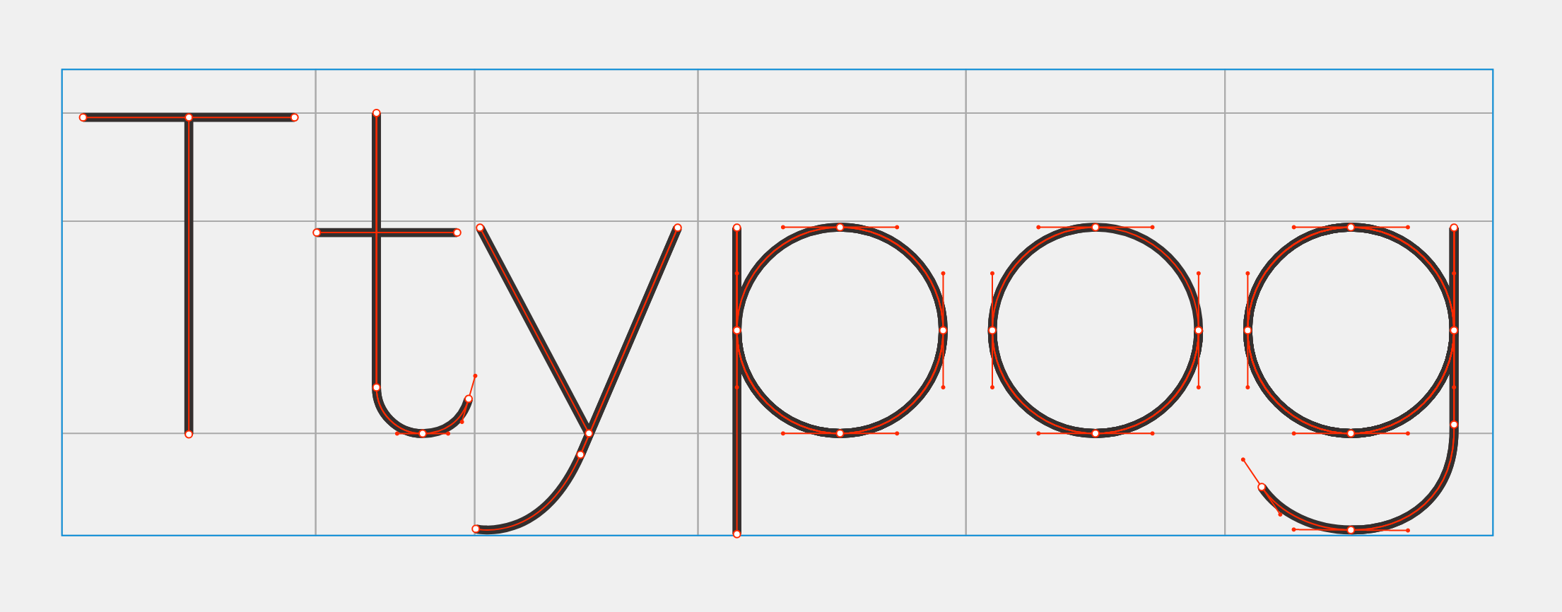
Figure 9 Leon Sans with small value for weight
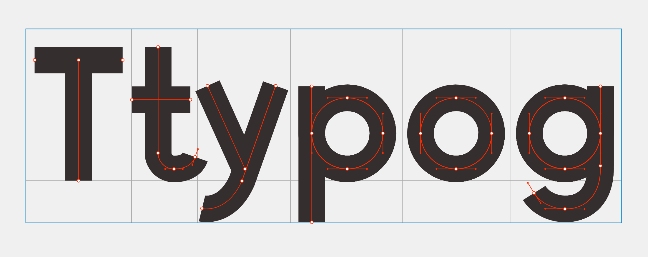
Figure 10 Leon Sans with large value for weight
Because the typeface is rendered by the Javascript engine on an HTML canvas element in real time, it can be object to continuous transitions, based on user interaction (though pre-programmed animations can also be created). This was the most important inspiration for the typeface described in the chapter the subsection Typography.
The main difference between the approach taken by Kim [14] and mine is that the former draws the typeface from inside out, that is, the vector information describes the center of the glyph lines and uses stroke width and style to make the font weight vary (see Fig. 9 and 10). As we shall see, in Typography the font files there were given and I used the existing contour of each glyph to perform transformations on each vector point.
The approach from Leon Sans works in this very specific case because this typeface has no contrast along its lines. The glyphs are drawn as lines without weight variations. This is the most important reason why this approach could not be used for the project described in Motley Agency branding 2020: analysis of the kinetic identity, where the contour of the typeface is very irregular. Nevertheless it was an important point of departure and inspiration for the expressive use of typography.
Barcelona Design Week 2019: variable typography
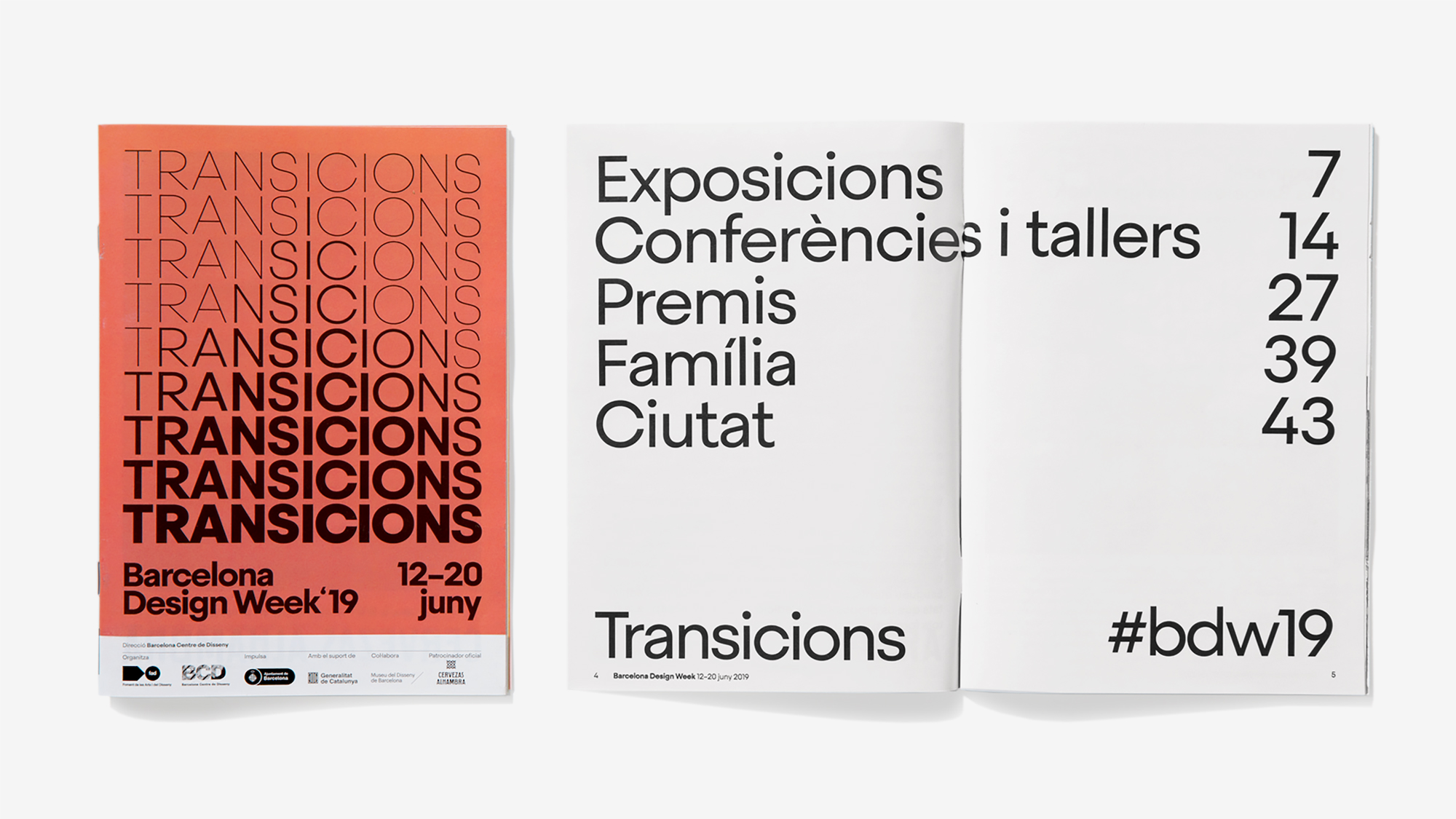
For the 2019 edition of the Barcelona Design Week, the local firm ESIETE worked with Argentine type designer Eduardo Manso to create a custom variable typeface (Fig. 11), based on the Steradian typeface family.
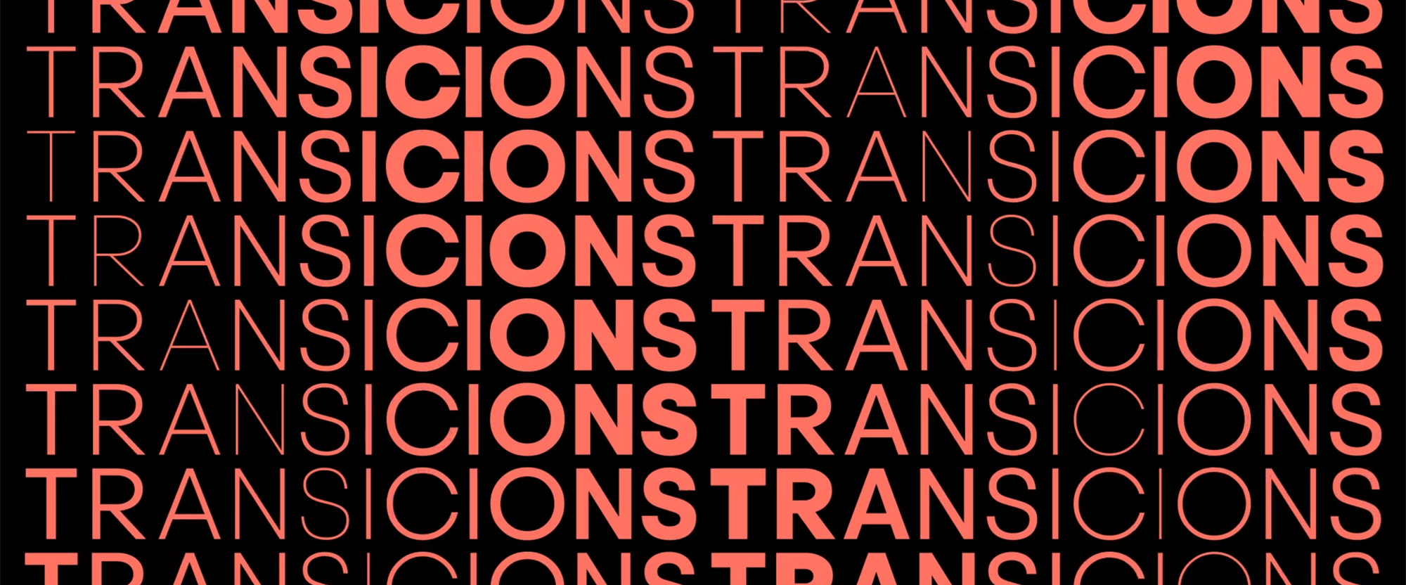
Figure 11 Variable typeface for the Barcelona Design Week 2019 visual identity [43]
The theme of this edition, transitions, represented in “the identity and the animations go beyond the basics by modulating the transitions from lightest to boldest not just left to right or top to bottom but diagonally and in chevrons” (Fig. 12 and 13 ) [43].
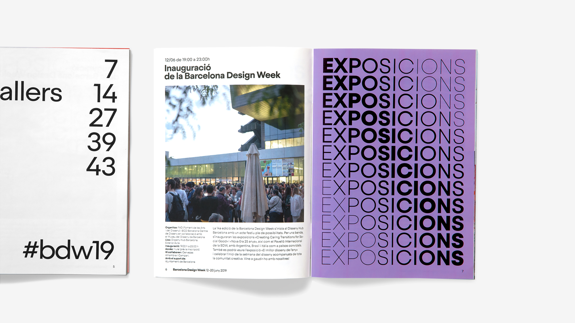
Although this use of typography is not in and of itself groundbreaking, it is worth highlighting because of its use of new developments in type technology, namely font variations (see again Typography in chapter Why a kinetic visual identity). Creating animations or even the static versions of the images in the examples above without resorting to it would render the task incredibly tedious, perhaps prohibitively expensive in this case, as every point of every glyph would have to be edited individually.
With a variable font it becomes easy to determine a transient thickness for individual glyphs at individual moments. The following code does not derive from the identity itself, but is a likely implementation of it. It translates into image (fig 14, first line) in the following way: each letter has its weight relative to its neighbour offset by 80, which is the number that divides the scale 100–900 equally. The first letter, T, has a weight of 100, the thinnest; the next one, R, 180; and so on until the last letter, S, has the weight of 900, that is, the thickest of them.
<div>
  <span style="font-variation-settings: 'wght' 100">T</span>
  <span style="font-variation-settings: 'wght' 180">R</span>
  <span style="font-variation-settings: 'wght' 260">A</span>
  <span style="font-variation-settings: 'wght' 340">N</span>
  <span style="font-variation-settings: 'wght' 420">S</span>
  <span style="font-variation-settings: 'wght' 500">I</span>
  <span style="font-variation-settings: 'wght' 580">T</span>
  <span style="font-variation-settings: 'wght' 660">I</span>
  <span style="font-variation-settings: 'wght' 740">O</span>
  <span style="font-variation-settings: 'wght' 820">N</span>
  <span style="font-variation-settings: 'wght' 900">S</span>
</div>
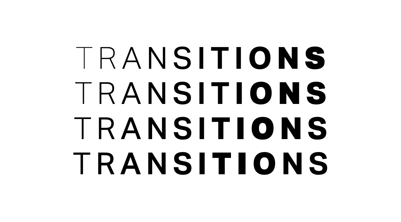
Figure 14 Recreation of of the effect from the Barcelona Design Week 2019 identity using a possible technique employed by the original creators. This example uses the variable font Aktiv Grotesk VF [18]
The next line of text would offset the weight distributions by one unit, so instead of starting with 100 it would start with 180 and continue from there.
<div>
  <span style="font-variation-settings: 'wght' 180">T</span>
  <span style="font-variation-settings: 'wght' 260">R</span>
  <span style="font-variation-settings: 'wght' 340">A</span>
  <span style="font-variation-settings: 'wght' 420">N</span>
  <span style="font-variation-settings: 'wght' 500">S</span>
  <span style="font-variation-settings: 'wght' 580">I</span>
  <span style="font-variation-settings: 'wght' 660">T</span>
  <span style="font-variation-settings: 'wght' 740">I</span>
  <span style="font-variation-settings: 'wght' 820">O</span>
  <span style="font-variation-settings: 'wght' 900">N</span>
  <span style="font-variation-settings: 'wght' 820">S</span>
</div>
The method described above is the simplest for creating such a transition: a linear interpolation between the first and the last weight, i.e. each step is equal to every other step. But using curves makes the result more visually appealing. One possible way to do it with the example above is by using a cosine wave to transition between the values. The following simplified code shows an example of how this could be done:
const output = Array.from('TRANSITIONS').map( (letter, i) => {
  const angle = i * ((Math.PI) / 10) - Math.PI;
  const cos = Math.cos(angle);
  const mappedAngle = Math.cos(angle)*0.5 + 0.5;
  const values = Math.round((mappedAngle * 800 + 100) * 1000)/1000;
  return '<span style="font-variation-settings:
                \'wght\' '+values+'">'+letter+'</span>';
})
This would give us the following:
<div>
  <span style="font-variation-settings: 'wght' 100.000">T</span>
  <span style="font-variation-settings: 'wght' 119.577">R</span>
  <span style="font-variation-settings: 'wght' 176.393">A</span>
  <span style="font-variation-settings: 'wght' 264.886">N</span>
  <span style="font-variation-settings: 'wght' 376.393">S</span>
  <span style="font-variation-settings: 'wght' 500.000">I</span>
  <span style="font-variation-settings: 'wght' 623.607">T</span>
  <span style="font-variation-settings: 'wght' 735.114">I</span>
  <span style="font-variation-settings: 'wght' 823.607">O</span>
  <span style="font-variation-settings: 'wght' 880.423">N</span>
  <span style="font-variation-settings: 'wght' 900.000">S</span>
</div>
Notice how the wght parameter changes as a function of a sine wave, as opposed to fixed-size steps. Fig. 15 shows a comparison between the first method (upper line) and the second (lower line).
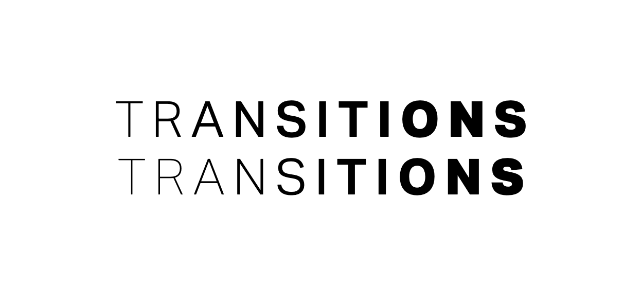
Figure 15 Recreation of the transition effect from fig 14 (upper line), but using a cosine wave instead (lower line)
This smoothing technique was also used in the subsection Typography, where I have used a cosine wave to modulate the font weights and avoid the dull, linear transition. Although, for reasons that will become clear, there I was not able to use a variable font and another approach to transitions had to be taken.
Graphcore: generative graphical elements
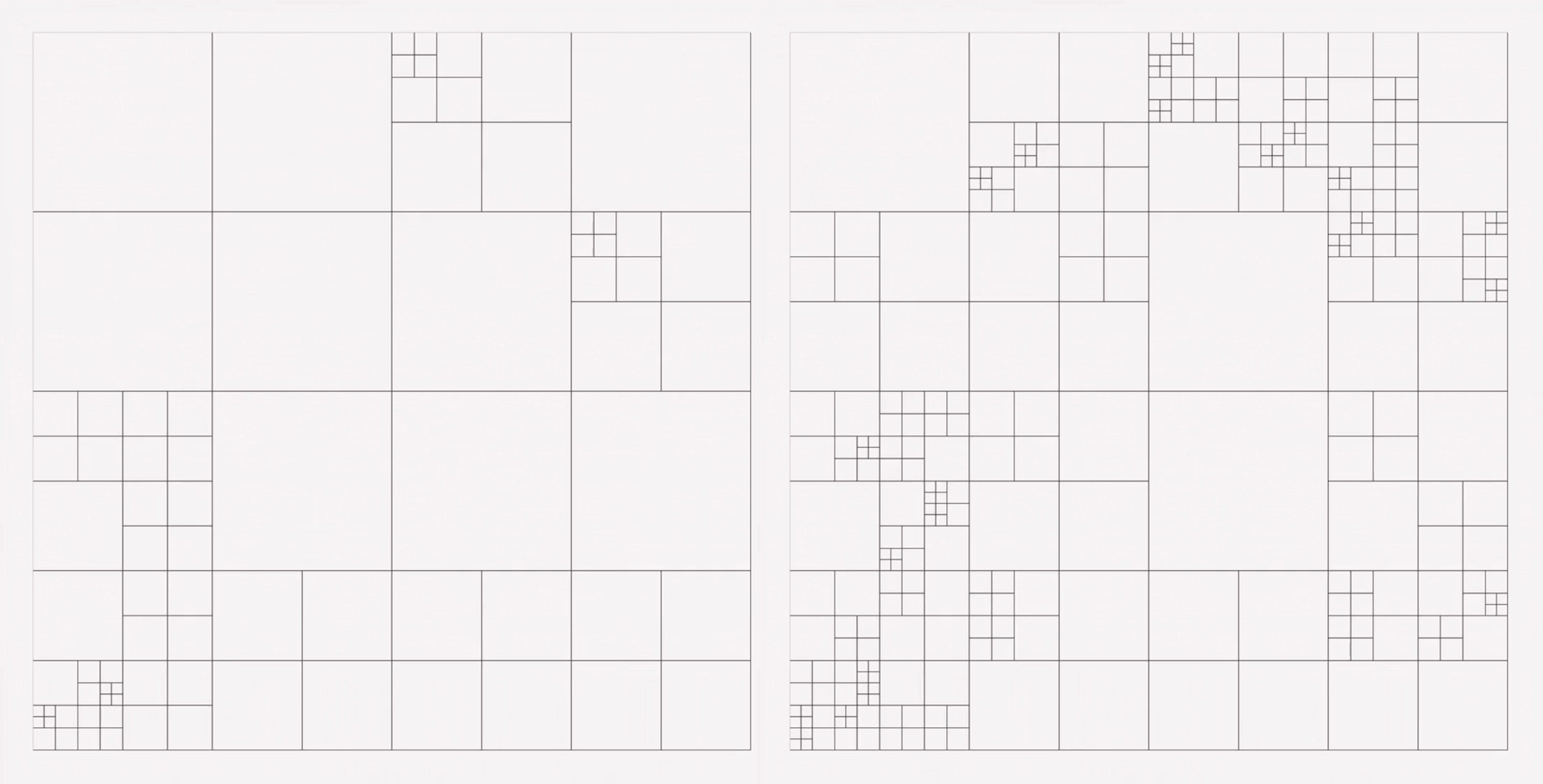
Figure 16 Two stages of a grid generated by the Graphcore grid system. Image from Pentagram [31]
The Graphcore visual identity, created by Pentagram [31], uses a grid system (Fig. 16) as the basis of the algorithm to generate graphical elements. In principle, this algorithm could be followed by a human agent to create those elements in a manual process. Such process, as it can be deduced from public data about this case, is the following:
- create a grid (which is always similar, but never the same, see 16):
split the canvas into four columns and four rows (Fig. 17 a);
choose a random square defined by that split;
further split that square into two columns and two rows (Fig. 17 b);
if the grid is ready, stop, otherwise go to e;
choose a random square within the newly created sub-grid and continue to c (Fig. 17 c);
if the grid is ready, stop, otherwise go back to b.
define the amount and frequency of each of the shapes defined by the brand guidelines;
place the shapes on the grid, respecting the box sizes defined in step 1;
apply colors to the shapes according to the colors section of the brand guidelines;
As suggested in the section Visual identity in the digital age, this rather tedious process can be encapsulated by software, which allows for the creation of an immense variety of graphical elements while ensuring they follow the brand guidelines. That is exactly what Pentagram did: a desktop application (Fig. 18) that Graphcore employees (and presumably their partners) can use to generate graphical elements.
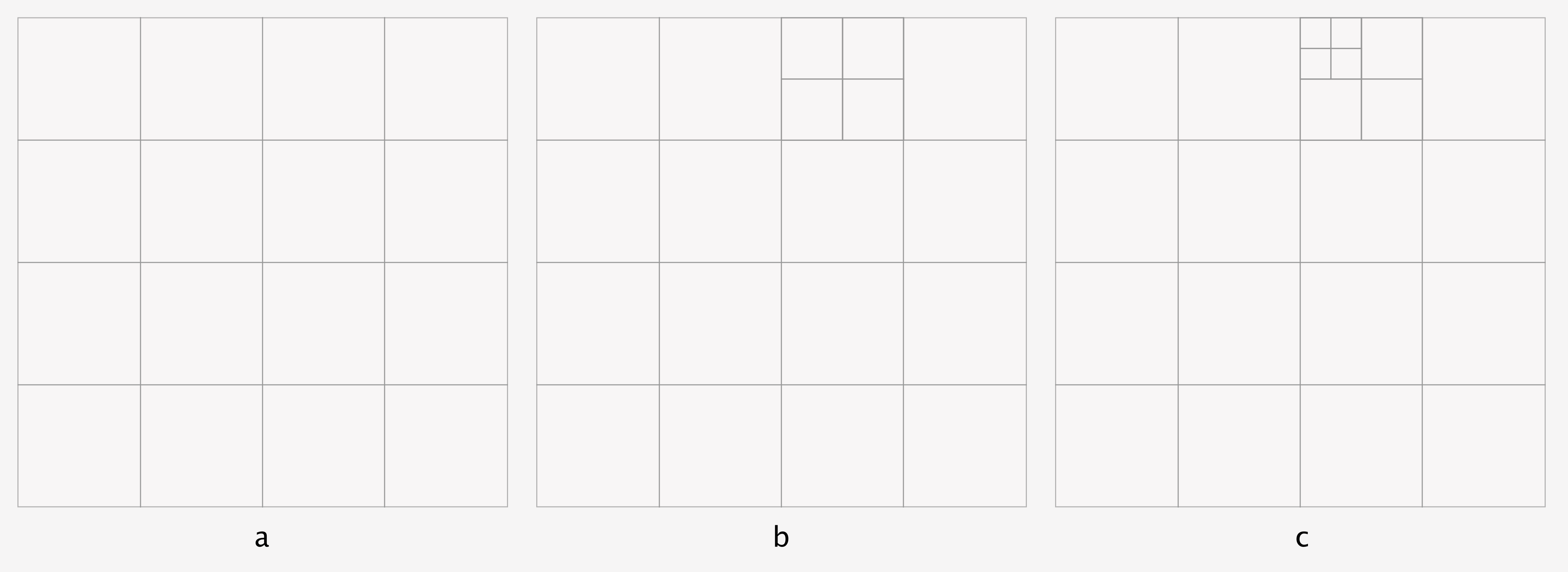
Figure 17 Three iterations of the grid algorithm. Image by Régis Frias.
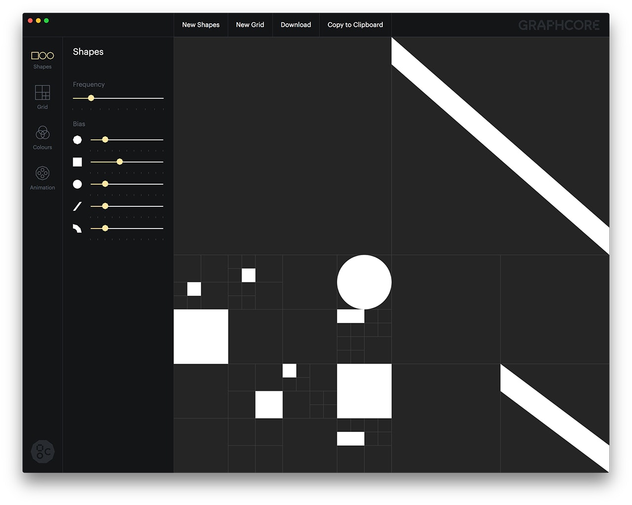
Figure 18 Graphcore desktop application for generating graphical elements. Image from Pentagram [31].
Figures 19 and 20 show a sample of the graphical elements applied to business cards. Here one can easily see the variety of versions that can be created and, at the same time, how well they adhere to the brand guidelines.
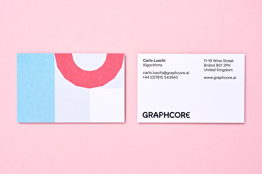
Figure 19 A business card with generated graphical elements. Image from BrandNew [42]
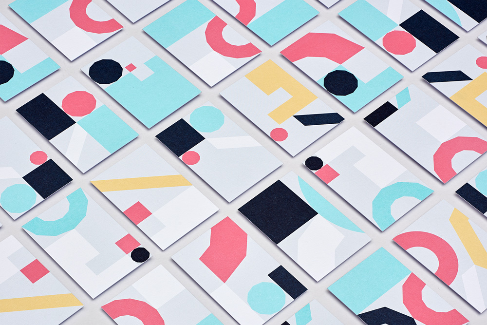
Figure 20 A wide variety of graphical elements can be generated by the application. Consistency and adherence to the brand guidelines is guaranteed. Image from BrandNew [42]
As the example applications show the grid logic was carefully crafted to produce visually appealing results, by means of a thoughtful compromise between repetition and variation. Even stripped from the graphical elements it already creates a balanced composition (see again Fig. 16).
The preexisting graphical components—octagon, square, circle, diagonal line, faceted arc—can be easily accommodated within a square of the grid, by design. User defined biases for each of the components will determine which and how many of them will be generated. This is the greatest source of control for the human agent operating the application, and, one could say, room for the creative use of it.
A parameterised desktop application as the one described above is not a requirement for this kind of approach to visual identity to work: one could easily imagine a script that generates an indefinite amount of graphic elements or even a limited number pre-generated by the authors of the visual identity. On the other hand such an application helps to keep human agency as the main source of judgement for the outcomes. Humans using it will generate the visual elements with their own parameters and choose the ones that best fit their current goals or use case.
Genesis Beijing: generative logo and identity
Wolff Olins created the visual identity for Genesis Beijing, “a public development that combines a hotel, offices, gardens and a museum [28]”, with motion at its very core:
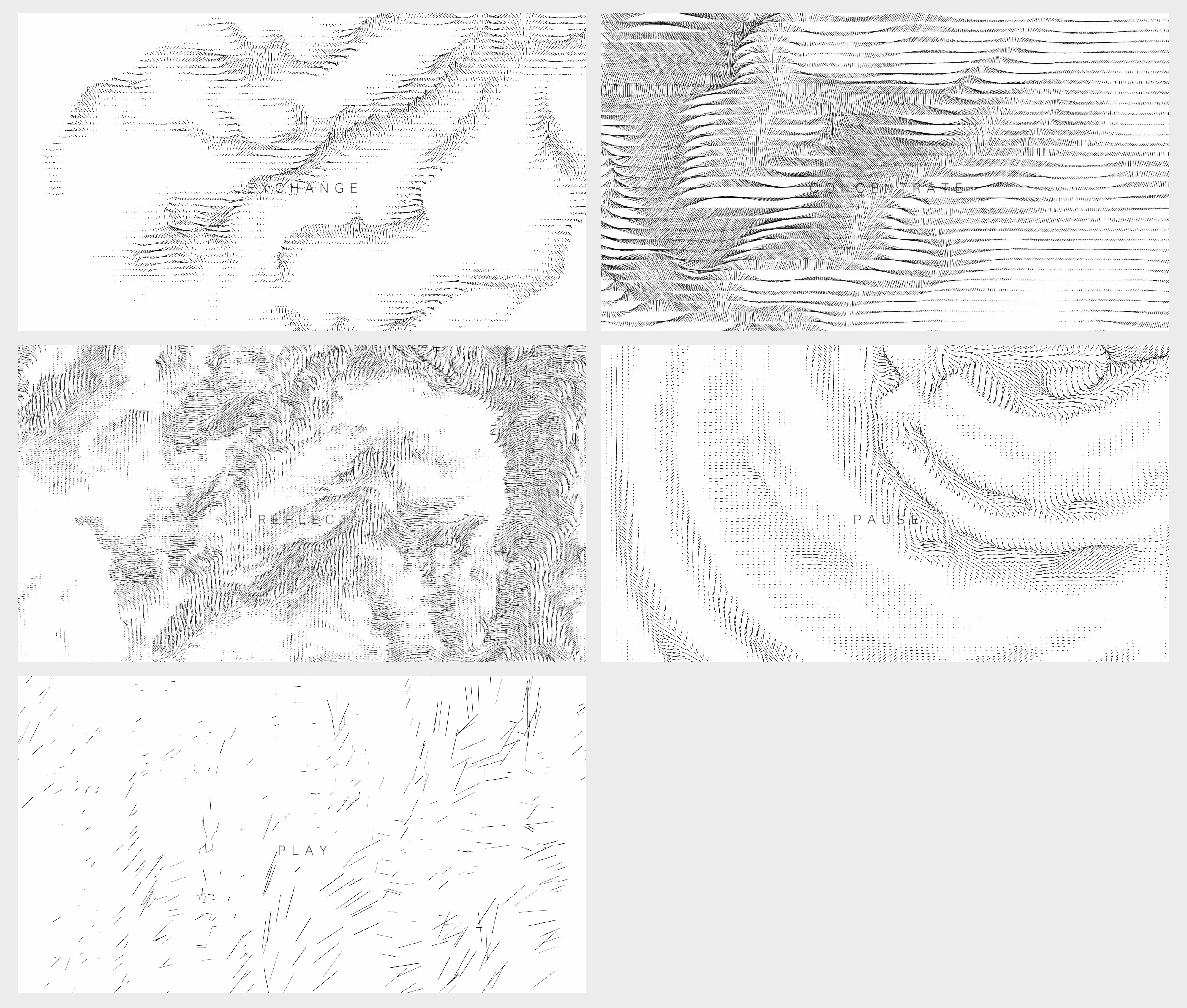
It’s built from five patterns or ‘flow states’ that form the experience of ‘wu wei’ – play, pause, reflect, exchange, concentrate [28].
The result is a logo (Fig. 21) and graphical elements Fig. 22 that are not fixed by a brand book, but can be created in many variations in different situations. In traditional identities the logo does not animate except in transitions, but the Genesis Beijing logo can be shown as an ongoing animation. This is an extreme version of the dynamic visual identity explained in the subsection Static and dynamic visual identities.
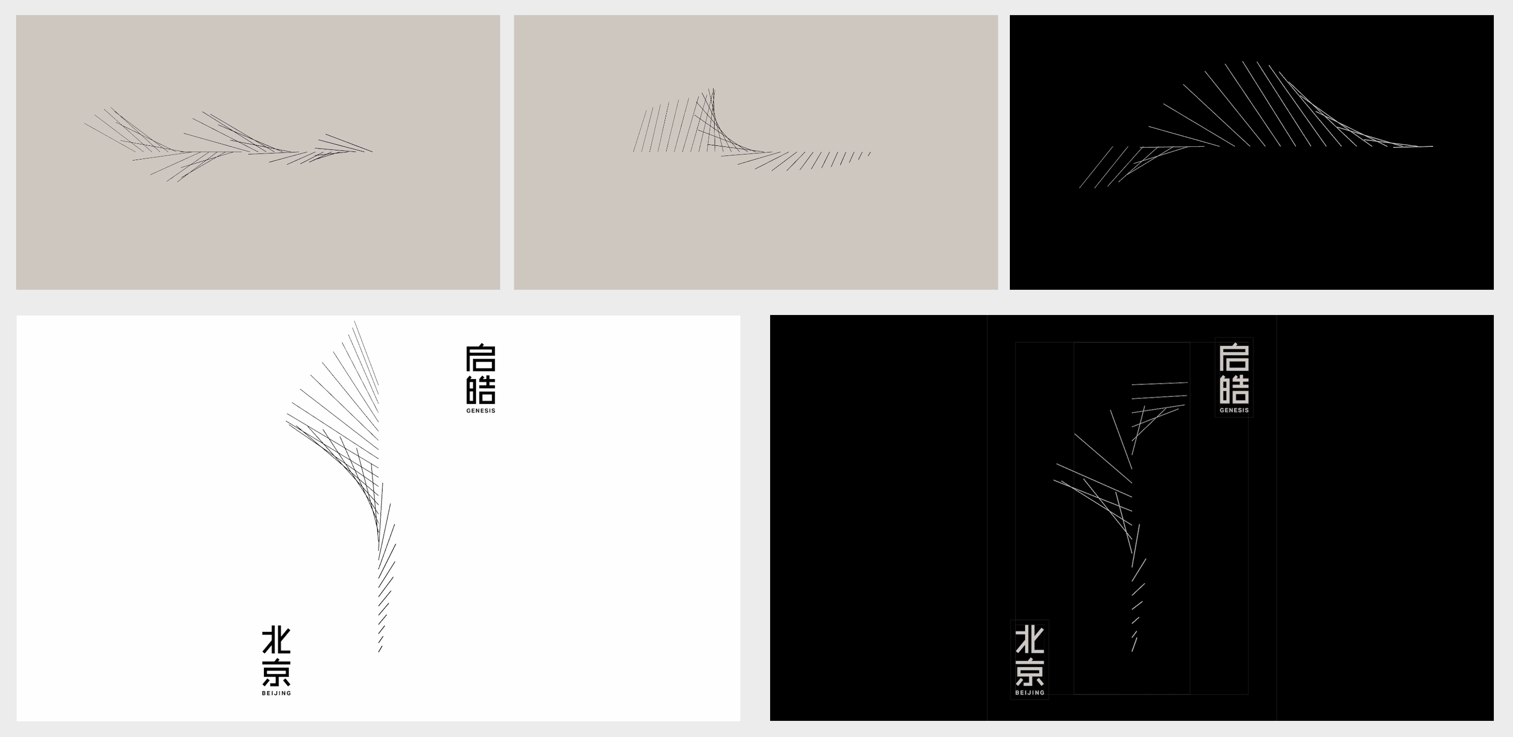
The graphical elements come from the five patterns mentioned above (Fig. 22). As with the logo they can also be shown as ongoing animations. It is important to note, though, that both the logo and the graphical elements suggest motion even in static settings, such as print.
Wolff Olins also created a desktop application for generating brand visual assets (Fig. 23). Users can control the variation of the logo with parameters such as line length, rotation points, flow and line frequency, as well as colors and added randomness. Again the visual identity is kept consistent by the inner logic of the algorithm, which allows variations only within certain boundaries.
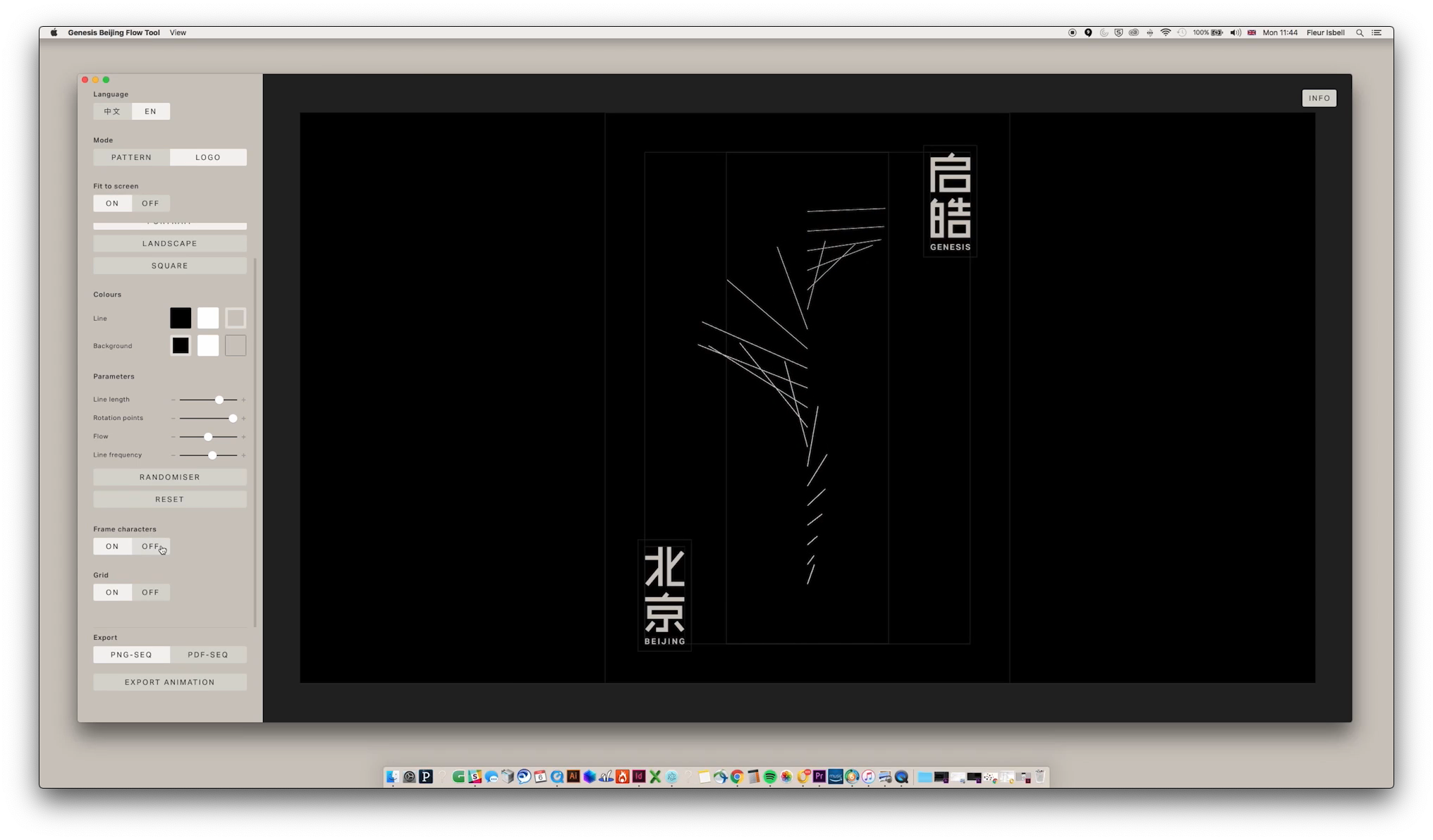
Figure 23 Genesis Beijing desktop application for generating brand visual assets [28]
As a final note, I would like to mention that the definition I gave of a kinetic visual identity implies the concept of built-in motion, but one should not understand that as a statement that the motion should always be present, or actualised. Instead, what it means is that motion and interaction should be considered from the foundation of the visual identity.
Key findings and reflexion
The research question that this thesis is trying to answer (how has the modern computer, in the guise of software, caused changes in the practice of visual identity?) was posed in the form of how, instead of whether; that is, the question presupposes that the changes have already happened. This question arised partly from the observation of cases such as the above.
The approaches and techniques shown in this chapter are important building blocks for the development of dynamic identities, as explained in Visual identity [25]. That is, the identity is not ready when the brand guide is delivered, but it will be continually updated and expanded as new uses emerge and as new stakeholders join the conversation.
Specifically regarding typography, Leon Sans (Leon Sans: an algorithmic typeface) opened for me the possibility of a typeface that can be continuously transformed in real time and which can be used expressively (ref. to Typography). In the project described later (Motley Agency branding 2020: analysis of the kinetic identity) I did not try to mimic this behaviour, but, rather, drew inspiration from it and applied some of the thinking to another context.
Barcelona Design Week 2019: variable typography covers another area of the expressive typography landscape. There, suggested motion—in the form of repetition with variations—rather than actual motion strikes the balance between consistency and variety.
Graphcore: generative graphical elements and Genesis Beijing: generative logo and identity embed motion and flexibility in their desktop applications. This possibility was a starting point for the project in Motley Agency branding 2020: analysis of the kinetic identity, but not (or at least not yet) implemented. But more important than the desktop applications are the possibilities opened up by them, which are essentially those brought about by the advent of software (see again, e.g., The movable type and the digital revolutions ).
The use of a desktop application potentialises the future creation of visual assets (as opposed to their being predefined in the brand guide). But this is not the only way of creating open or flexible visual assets. A desktop application gives users the ability to interfere in the creation of the assets by means of changing its preprogrammed parameters.
On the other hand there is no reason why the parameters could not be changed in real time not by employees of the company or their creative partners, but by the end users themselves. In that case they could create and modify visual assets as they interact with some of the touch-points a brand has with them. This is at the core of the idea of the kinetic—and, more specifically, interactive—visual identity (ref. to Visual identity in the digital age).
I have kept the attention of these cases on two main components of visual identities: typography and graphical elements, since this is the focus of the project described in the chapter Motley Agency branding 2020: analysis of the kinetic identity. These elements are, in that chapter, highlighted for their kinetic and interactive features.