Motley Agency branding 2020: analysis of the kinetic identity
The first task of this thesis was to present the expanded palette of visual design brought about by digital technologies, software in particular, mainly where it touches motion and interaction. This has been done in the chapter Why a kinetic visual identity, and particularly in the section Visual identity in the digital age.
The second task and actual goal of this thesis is to show some ways how this expanded palette can contribute to create dynamic visual identities, such as has been explained in the section Visual identity. This has been done in part in the chapter Case studies. But in the forthcoming section (Kinetic and interactive brand assets) I will further explore this avenue by describing a case in which I worked, focusing on the technical aspects of it to address the issues raised in the section Visual identity in the digital age.
The case was done for the company where I work and was achieved after an initial phase of open-ended exploration of the technical and aesthetic possibilities. This phase included a hack-day at the company, in which I helped to facilitate a typography workshop, where both designers and developers participated.
I will present here only the parts of the final project that are relevant to this thesis, and in which I had an active role. Motley agency—the company where I have been working since September 2018—started to roll off a new brand for itself in the end of 2019. I joined this effort as a developer, and my role was to support the creation of technical capabilities for a kinetic and/or interactive brand identity.
The company
Motley is a ten year-old “change agency” based in Helsinki that uses visual, service and content design, strategy, and technology towards “[…] improving people’s lives and transforming the fate of our environment” [21]. Motley offers a range of services in digital transformation and strategy; user insights and service design; brand and storytelling; and digital products and services.
Among its clients are major Finnish brands, such as the department store Stockmann, Posti (the Finnish postal service company), Helen (a Helsinki-based energy company), Moomin Characters, etc.
The team is made up of “strategists, designers, content professionals and developers” [21]. The company prouds itself of applying a transdisciplinary approach to address its clients briefs. In that spirit I have, despite having been hired as a developer, participated in as much of the design process in the projects as was possible. My goal was, first, to make sure I understand the projects well enough and assess the technical needs early on; but, secondly, to try to participate in—and hopefully influence—the creative process and final designs from a technical vantage point.
The purpose of the company is to create positive change for the clients and—through them—for the society at large. Change is at the core of everything that Motley does and a new brand should reflect this spirit somehow. This is one of the reasons we decided to implement a visual identity that was both dynamic (as defined in Static and dynamic visual identities) and kinetic (as defined in The movable type and the digital revolutions).
The project
The solution presented in the following sections does not aim to address all of the concerns of the visual identity of a brand, as explained in the section What is a brand? The scope of this thesis is limited to two kinetic brand visual elements, which, in aggregate with other actions (themselves outside of the scope of this thesis), aim to create a comprehensive brand strategy.
But these visual elements contribute to the overall brand identity in an important way: they are, borrowing Murdock’s words, “open and flexible” by design [25], (p. 53). They only come into existence in their interaction with the users (at least in the case of the company website, where I employed the techniques described in later sections). The goal of keeping the elements open is to allow the visual identity to be dynamic, as described in the section Visual identity. That is, as opposed to a static approach, the identity is never finished.
On the other hand, we wanted to create an identity that was connected to its audience in a fashion similar to what Moody proposes [20], and as was described in the section Visual identity in the digital age. The interaction itself is not groundbreaking, but the main goal was to build motion right into the core of the visual identity (see again Genesis Beijing: generative logo and identity).
The two elements described in the section Kinetic and interactive brand assets are: a morphing octahedron (Emblem) and a continuous-weight, interactive font face (Typography). The overall consistency of the identity—which is also required in a dynamic approach [25]—is guaranteed by two factors: in the case of the typographic element, by the design of the typeface, whose defining features are kept intact by the technique; and in the case of the emblem, by the underlying logic of the algorithm (explained in more detail in the section Kinetic and interactive brand assets).
Other brand elements were created by the designer in charge of the project, József G. Kiss, and are part of the overall brand strategy, but are outside of the scope of this thesis. I will not attempt to elaborate further how my current scope relates to the brand strategy as a whole. The present goal is solely to show technical possibilities for creating kinetic graphic elements with modern technologies. These possibilities are meant to illustrate the expansion of the visual identity space, whose case was explained in the section Visual identity in the digital age and, at the same time, show one way of using these technologies to create a dynamic visual identity.
The process
We used the company’s own methodology, summarised by the triad build–measure–learn. Build a prototype that contains the features of the desired output that we want to assess; measure the behaviour of the features in conditions as similar as possible to that of the desired output; learn what worked and what did not work. Then repeat the process until a so-called minimum viable product, or MVP, is achieved. The MVP is, of course, not the end of the process; since in the company we are mostly dealing with digital products, we will continue learning about the performance of the products in real-life situations, with real customers and more abundant and relevant data.
For the project described in this thesis, this methodology meant creating small experiments to learn about the technological and aesthetic capabilities and behaviour of kinetic elements. In the case of what later became the emblem animation, the designer in charge, József G. Kiss, created graphic elements (some static and also some animated) to kickstart the process. We created several variations of those initial elements in an iterative way. I experimented with bidimensional as well as three-dimensional shapes.
The first drafts were made with Processing [9] with Java mode, since this is the quickest way to get something working and I did not know at that point where (and even whether) the experiments would be used. I knew that the code, whenever ready would have to be ported to whatever language or platform would suit best the final delivery medium.
One of the versions was a simple program based on two subdivided circles (Fig. 24). This created two polygons of varying number of sides. All of the vertices of one of the shapes were connected to the closest equivalent vertices of the other shape. This was my first interpretation of the designer’s idea of lines.
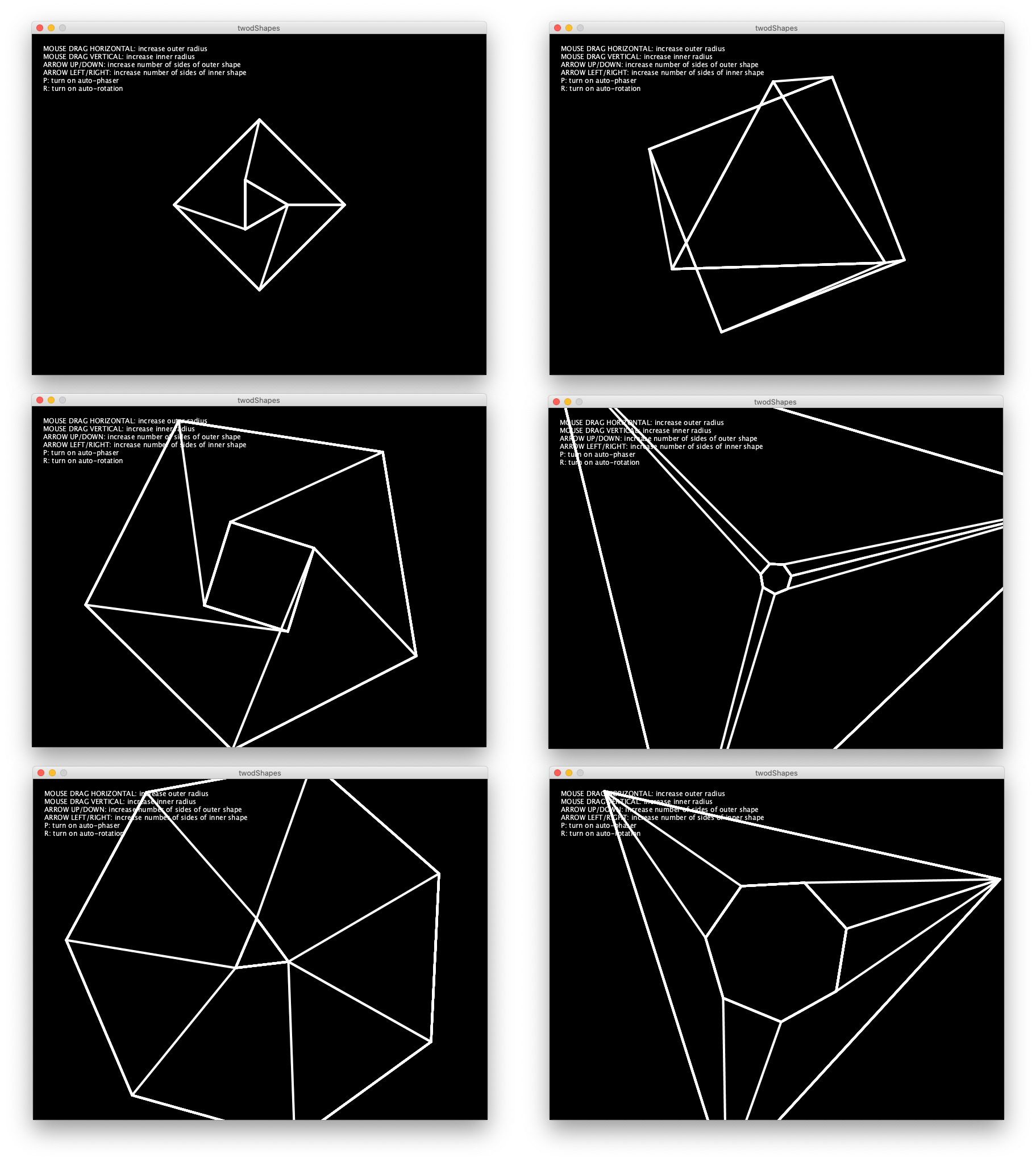
Figure 24 First experiments with lines.
In the meantime, József decided to explore three-dimensional shapes and suggested the octahedron (see Emblem). We explored the idea of exploding this three-dimensional shape into alternative ones, with random vertices (Fig. 25). This informed us that the vertices should not be completely random, otherwise they might, for instance, all end up in one side of the shape, effectively turning it into two dimensions.
Furthermore, exploding the shape in this way, just into random vertices with the same distance to the axis, did not give enough contrast between the two shapes. This led to the approach described in the subsection Emblem. There the basic idea is still the same: start with an octahedron and explode it to random vertices, but we also built constraints to the randomness: make sure the vertices expand roughly to the same direction as where they currently are; keep the expansion within a virtual box so that the vertices are always visible on screen.
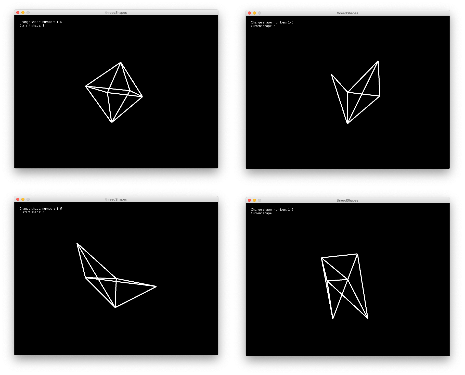
Figure 25 A later version of the experiments with an octahedron.
I decided early on that whatever we did it had to be possible with web technologies so that we could also use the results in online applications. The easiest prototyping tool for web technologies is, in my opinion, p5.js [30]. I created a simplified version of the same idea using p5.js and was satisfied with the direction. This gave me the confidence that it could also work on the web.
I had assumed that the most performing way of creating these shapes would be the SVG element, because, whatever the scale, the computation is always the same. But it turned out that this version was computationally expensive and I had to re-write it with HTML canvas. This fact was a surprise to me.
The other component of the visual identity was inspired by Leon Sans: an algorithmic typeface. Motley organised hack-day in October 2019 and encouraged employees to submit proposals for themes. I proposed a workshop in which both designers and developers would work together to experiment with kinetic or interactive typography.
I suggested we do something related to the new visual identity of the company, which was at that point being developed. József, who was responsible for the identity, proposed we experiment with the brand typography (Fig. 35). This was a turning point for the project and my own further personal development. Until then the idea had been vaguely defined in my mind as a typeface following the same logic as Leon Sans: an algorithmic typeface, which was completely generated with code.
But in order to meaningfully manipulate a given typeface I would need access to its vector data. In preparation for the workshop I searched for methods of accessing the vector data of a font file. This is how I found OpenType.js [29], which opened up for me a new way of looking at a font file. It is equivalent to writing a text on Illustrator or similar application and then creating curves (or outlines) from it. One gains the ability to manipulate any point in the glyph however one wants. This was the breakthrough that opened the doors to real-time, interactive text transformations of font files.
We started the hack-day with the ability to load and parse vector data from a font file and a vague idea of morphing one font weight into the other. By the end of the day we had a proof of concept of what later became the component described in Typography. This initial version was very rough, but it showed us that we could interpolate two font weights in real time and possibly with user input.
This version also showed another area for further investigation: text layout. The hack-day experiments only used one or a few words as a basis for the transformations. But the website design—and any possibly meaningful uses of this idea—would require the text to be laid out over more than one line. That is, it needed to fit in a text box (see Typography).
OpenType.js does not offer a solution for this out of the box, so I tried an external library [12]. This library had not been maintained for four years and was still marked as experimental. It seemed to me that this path would bring problems down the line. Therefore I continued exploring alternatives for loading and parsing font files with Javascript.
The answer I found was Typr.js (Fig. 26) [34]. It was solid enough to run the typography engine of an online equivalent of Photoshop [32]. I discovered that it was also easier to use and adapt because it gave more control over the font data.
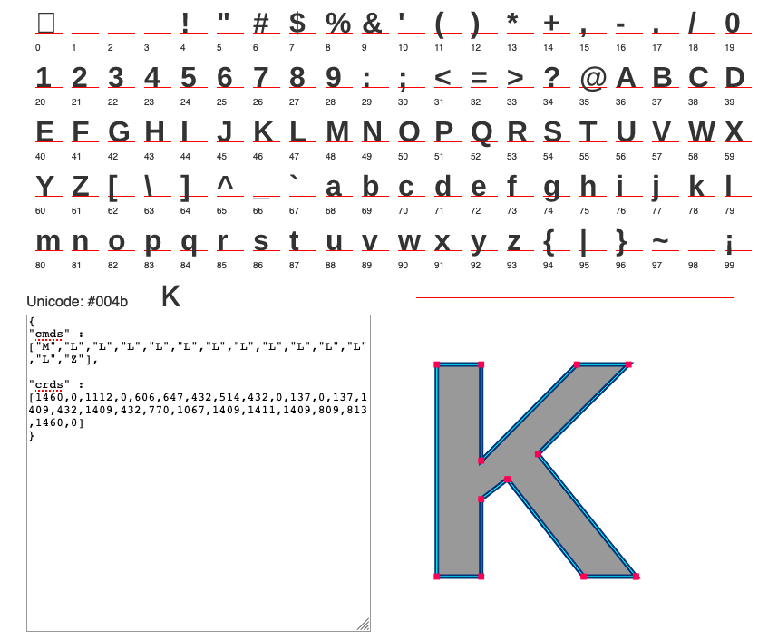
Figure 26 A font file loaded with Typr.js
The experimental phase gave me the confidence that this kind of approach could be used in developing kinetic and interactive elements for the visual identity we were working on. The back-and-forth between visual ideas and software development, already timidly explored in some previous client works, also proved fruitful the more we worked together and matured our ideas and approaches.
Kinetic and interactive brand assets
Emblem
The company emblem up until 2019 was a letter M composed of two-dimensional diamonds (Fig. 27). This shape was echoed on the logotype designed in 2017 on the letter o, which also represent brackets used in programming languages (Fig. 28).

Figure 27 Motley emblem.
Figure 28 Motley logo.
Another of the new realities faced by brands nowadays (refer to What is a brand?) is that “[t]he most successful brands are not static, but fluid” [27], p. 17. Also:
It’s no longer possible for a business to build a monolithic brand on top of a built-to-last strategy. Instead, it has to flip into a new mode, one that can adapt to change, enroll customers on their own terms, and relinquish more control of the brand to advocates. [27] (p. 104)
To symbolise this “brand flip”, the updated Motley brand identity introduces a new emblem (Fig. 29) without imposing to it a unique or static rendering (Fig. 30). Variations of the emblem (and, really of any visual elements of the brand) can be created by anyone and attached to the pool of assets.
Figure 29 Motley logotype and one of the possible manifestations of the emblem from the new identity.
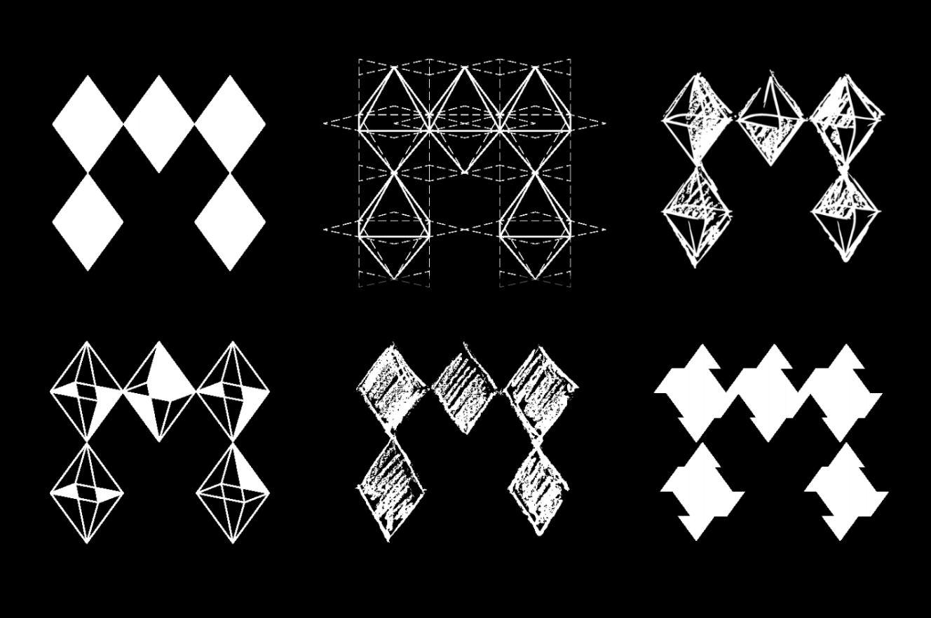
Figure 30 Motley emblem variations.
One of the manifestations of the emblem is an octahedron (Fig. 31)—that is, a possible three-dimensional version of a diamond-like shape. It can be created on a computer by a set of vertices and a set of edges (connecting lines), as shown on Fig. 32.
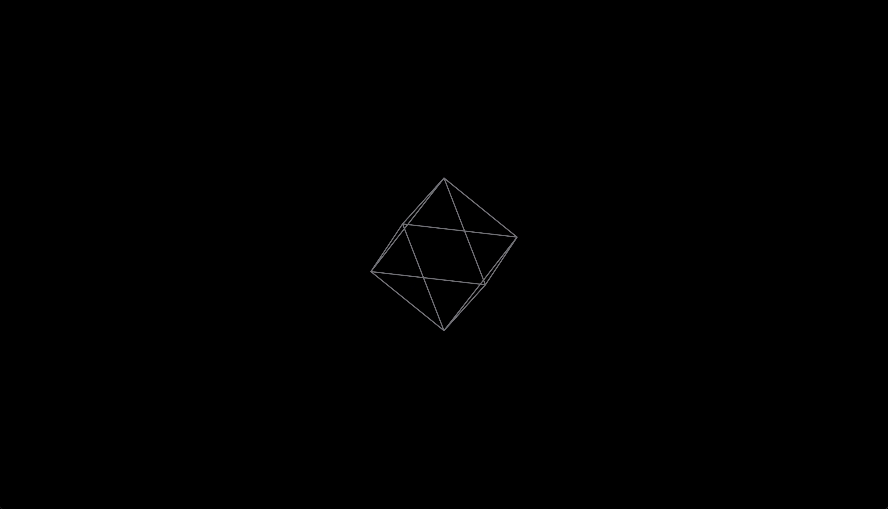
Figure 31 The octahedron version of the emblem.
const EMBLEM = [
  [ 0, 0,-1],   // index 0
  [ 1, 0, 0],   // index 1
  [ 0, 1, 0],   // index 2
  [-1, 0, 0],   // index 3
  [ 0,-1, 0],   // index 4
  [ 0, 0, 1]    // index 5
];
In the code above, each set of three-dimensional coordinates (separate lines) is a vertex of the octahedron. To each set corresponds an implicit index (0 for the first, 1 for the second, etc.), which can be used as a reference to connect this point to others as described by Fig. 32:
const EDGES = [
  [0, 1],   // connect vertex with index 0 to the vertex with index 1
  [0, 2],   // etc.
  [0, 3],
  [0, 4],
  [1, 2],
  [1, 4],
  [1, 5],
  [2, 3],
  [2, 5],
  [3, 4],
  [3, 5],
  [4, 5]
];
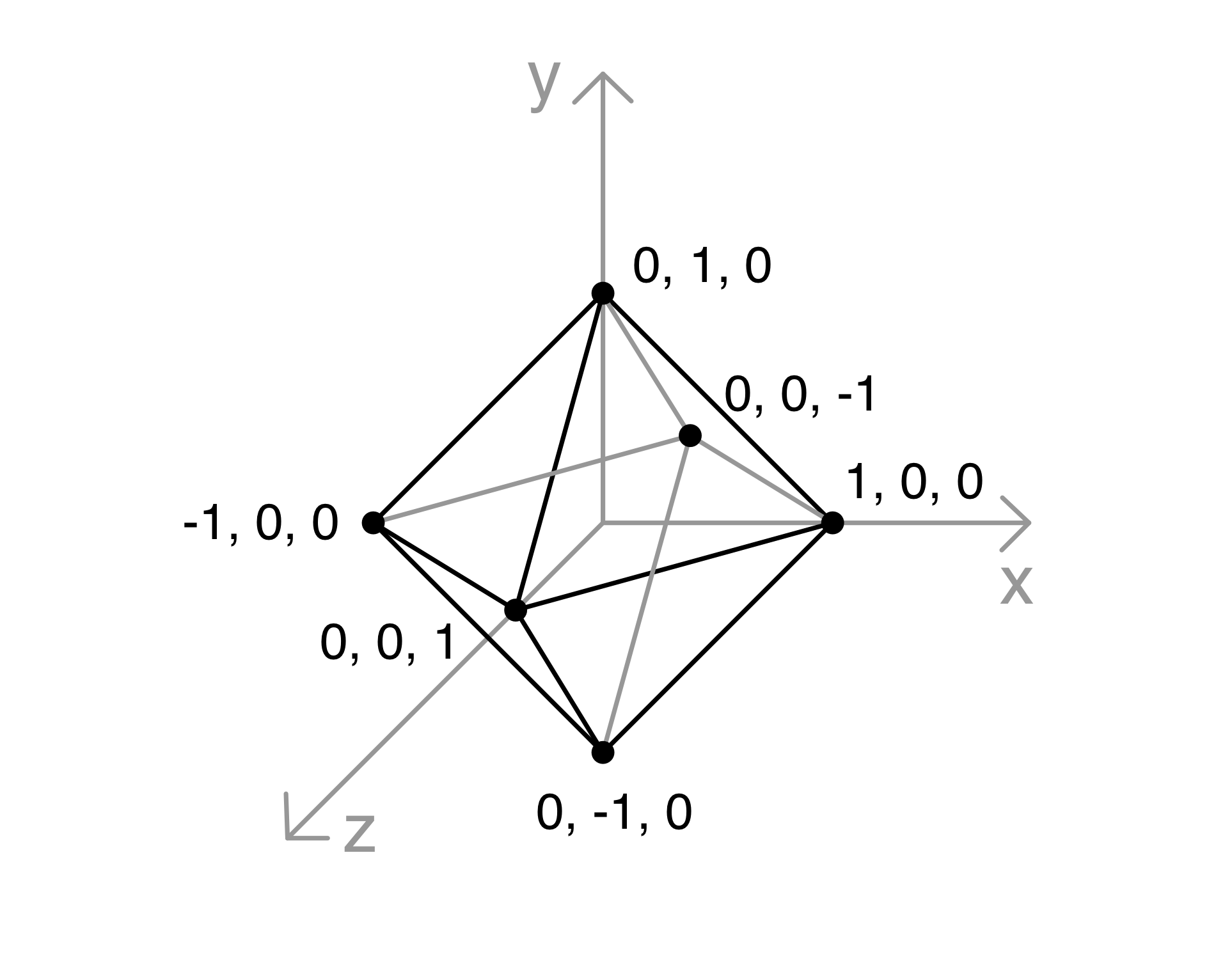
Figure 32 Vertices of a unit octahedron.
Simulating the three-dimensional rotation of an object on a two-dimensional surface—such as the computer screen—gives the viewer a better grasp of the shape of the object. The rotation is achieved by applying simple trigonometry to the vertices of the octahedron created above [3]. For example, to rotate the octahedron around the \(y\) axis we can use the expressions (1) and (2). The Javascript function that implements them is [3]:
const rotateY = (theta, nodes) => {
  const sinTheta = Math.sin(theta);
  const cosTheta = Math.cos(theta);

  let newNodes = [];

  for (let n=0; n < nodes.length; n++) {
    const node = nodes[n];
    const x = node[0];
    const y = node[1];
    const z = node[2];
    const newX = x * cosTheta - z * sinTheta;
    const newY = y;
    const newZ = z * cosTheta + x * sinTheta;
    const rotatedPoint = [newX, newY, newZ];
  }

  return newNodes;
};
Finally, to obtain the image from (Fig. 31), we need to actually draw the lines to an HTML element (canvas or SVG). The simplest way to do that is to loop through the newly created set of points (that is, rotated points) which was returned from the function rotateY and draw the lines according to the constant EDGES.
The simplest way to represent this three-dimensional shape on a two-dimensional surface (the screen) is by means of orthographic projection, “where the drawing plane is parallel to the main plane being depicted and the projection lines are perpendicular to it” [5]. To implement this projection in our context we simply ignore the \(z\) axis [3].
One of the goals with the visual elements of the brand was to represent “agility and constant transformation as key values of the motley brand” [15]. For that reason, and to add more variation to the otherwise elementary animation we added a distortion to the octahedron, which defines new arbitrary shapes (for instance, on user click). The shapes from Fig. 33 and Fig. 34 were obtained by assigning random positions to the original octahedron vertices, while, at the same time, making sure that they all fall outside of the radius of the original shape and inside of the limits of the screen. In other words, when the user clicks on the screen, the octahedron explodes to the limits of the drawing area and continues rotating as if it was stuck to an imaginary box around it.
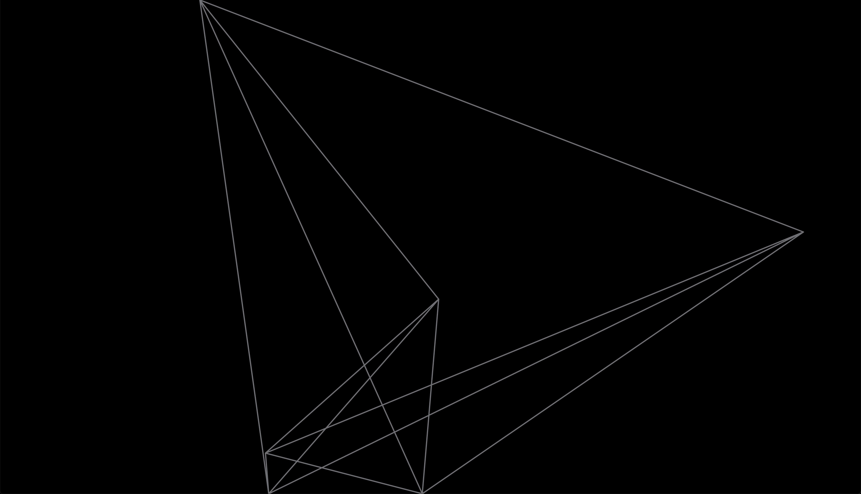
Figure 33 “Exploded” octahedron.
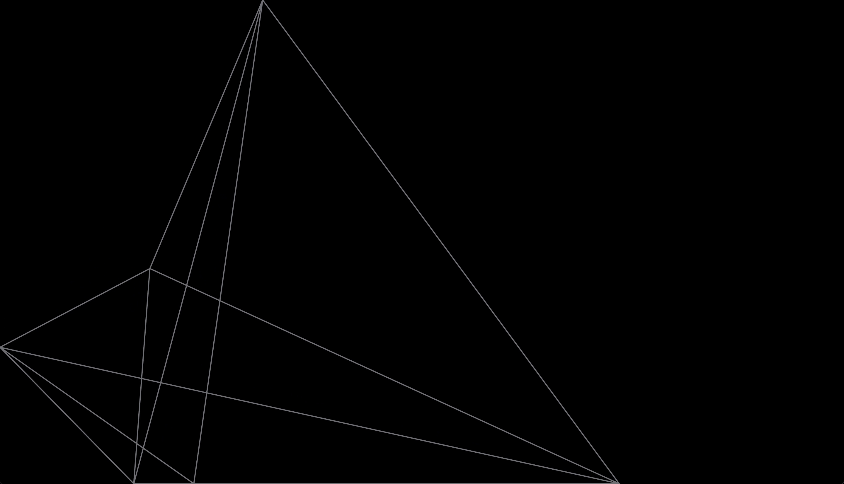
Figure 34 “Exploded” seen from another angle and with shape circumscribed to screen limits.
Typography
Although a similar result as that obtained with the techniques described in this subsection could be achieved with OpenType Font Variations (for example Barcelona Design Week 2019: variable typography), my initial goal with the project (and this thesis) was to open up the space for investigation on the expressive possibilities of digital typography (ref. to Visual identity in the digital age).
Another reason for the approach was the corporate typeface used for the company brand identity: Roquefort (Fig. 35), from Polytype has five weight variants, but is not available as a variable typeface [6].
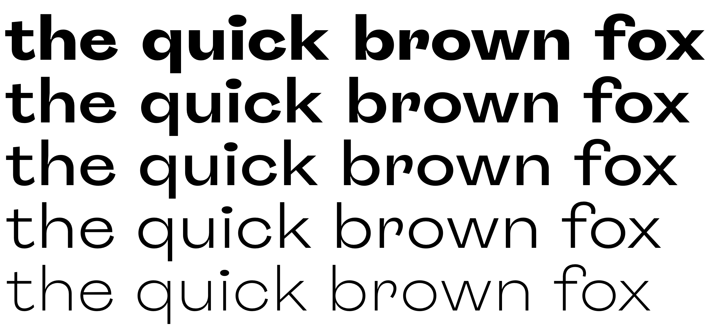
Figure 35 Motley 2020 brand identity typeface: Roquefort
The end result of the kinetic typeface is based on the following, fairly simple algorithm:
Next I will explain broadly each step of the aforementioned algorithm. I have prepared an open-source, bare-bones version of this algorithm for the technically oriented people to study the code and be able to obtain more details of the implementation [8]. The code has enough comments to guide its reading. A live example can be found here: https://fake-vfont.regisfrias.com/ [7].
1. Load and parse the fonts
The first thing to do is to load two font files: the thinnest and the boldest ones from Fig. 37 as ArrayBuffers with XMLHttpRequest. This operation returns a Promise for each font file.
After the Promises are both fulfilled I can use Typr.js to parse the ArrayBuffers and get font objects. These can be read and manipulated with Typr.js utilities (Typr.U).
2. Define size and a box for the text
If we were to render a traditional, static text, we would simply write an HTML element (for instance h1, which I will call sourceTextBox). This element would necessarily fit into an imaginary text box (Fig. 36).
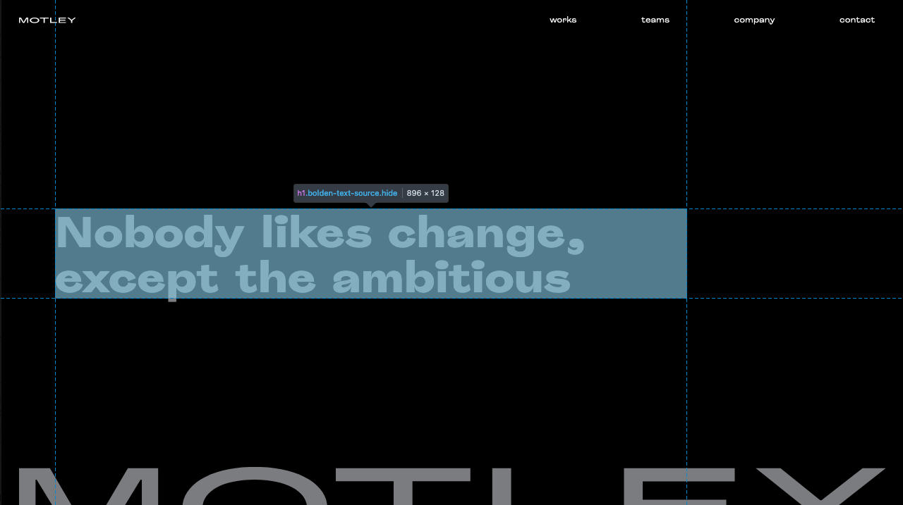
Figure 36 Bounding box for the HTML original element.
In the present case I still have that heading, but I use it only as a basis for the transformed typography. So I draw the HTML text where I want my canvas to be and make it invisible. Then I measure the space occupied by the text and create a canvas with the same size and at the same position. What the site users see in the end is only the canvas, not the original heading.
canvas.width = Math.floor(sourceTextBox.offsetWidth);
canvas.height = Math.floor(sourceTextBox.offsetHeight);
3. Lay out the text
When developing for web, a great deal of our job is performed by the browser. In normal circumstances, to create an image like that of Fig. 36 we only need to write <h1>Nobody likes change, except the ambitious</h1> and define some styles (like font weight and size as well as the width of the container). The browser will deal with laying out the text, that is, when drawing the words on the screen it will have to decide where to break lines, based on the font size, letter width and spacing, and the width of the container.
None of that is a given in our new approach. Typr.js has a method called glyphToPath() that returns the path of a text, which I will use to manipulate the font. The problem with this method for my purpose was that it assumes an infinite length for the wrapping object (that is, the text would overflow the screen to the right). Typr.js doesn’t care about containers as it deals with the glyph data in a rather abstract way. If you give Typr.js a sentence, it will happily add one letter after the next regardless of the size of the container (or even the screen for that matter).
So the task was to break the text into lines. Fortunately the authors of the library published an explanation of the logic of how to implement such an algorithm:
The idea is to measure the width of each word and then fill each line, until the width isn’t reached. After filling, you can align words to the right - left - justify. [33]
They also provided a high-level description of the algorithm to perform this task:
When you have some text, split it into words (“Hello world, what is your name?”).split(” “)
Then measure each word by measuring the distance betwee [SIC] pairs of characters - Typr.U.getPairAdjustment(…), the sum will be the width of the word. Once you have widths of words, e.g. [130, 50, 67, 82, 114, 38], you can split them into groups (lines), such that the sum of widths in each line is not bigger than your limit, e.g. [[130, 50], [67, 82, 114], [38]]. Then you can render them (two words on the first line, three words on the second, the last world on the third line). [33]
I use the bold file to lay out the text within the boundaries given by the HTML element (as explained in 2. Define size and a box for the text). Using the bold version makes sure that the thin version will surely fit in the same area, but the other way around is not guaranteed to work.
After implemented in code I end up with an array of strings, each line of text filling one slot in the array, like so:
laidoutText = [
  'This is the first line',
  'and this is the second line',
  'this text has three lines.'
] // this is the output of the function
4. Go through each point of each glyph of each line
Now that I have the separate lines of text I need to go through them, and in each one go through each glyph (that is, a for loop nested inside another for loop). At each glyph I get the vector data (vertices, Fig. 37) for the thin and for the bold font. I then map each point in the thin font with its equivalent in the bold font. Next I calculate the distance between these points.
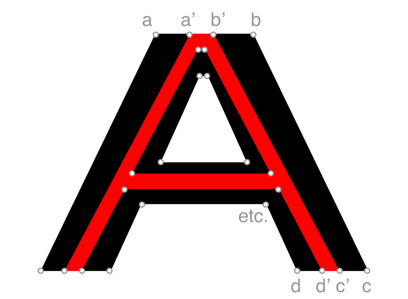
Figure 37 Vector data from the same glyph in two different weights (mild in red and strong in black).
In this picture you see two equivalent points on a glyph. The boldness of our type face will be a matter of how much the end result will be closer to the point on the red letter or on the black one. If the point coincides with the one on the red letter then you get the thin font exactly. Conversely, when the point coincides with the one on the black letter you get the bold font. If the point falls between these two you get a regular font and so on.
But in this case the amount of boldness is calculated at each point, based on the distance this point has to the mouse horizontal position. So I have to loop through each coordinate of each glyph to get each glyph’s path (using the method Typr.U.glyphToPath()). And for each coordinate I calculate the difference between x and y for each corresponding point of each font weight (Fig. 38). Then for each coordinate multiply the amount of thickness and the diff between each font weight.
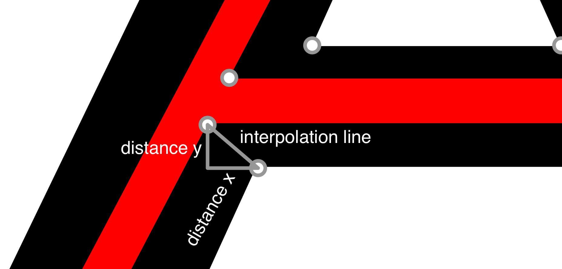
Figure 38 Distance x and y between two arbitrary points. The interpolation line shows where the transformed vertex will land: if the cursor is close to the original point the transformed point will land close to the point on the black shape; if the cursor is far the transformed point will land close to the point on the red shape.
Having each point and the distance between them we can move the transformed typeface (that is, the end result) along that line, effectively transforming the thin weight into the bold one, by simply interpolating between them. Say, at 0% the type is completely thin (the red A in Fig. 37), at 100% it is completely bold (the black A). At 50% it will land somewhere in the middle (for example the third line in Fig. 35)
Following is a summarised version of the function:
// loop through each line of laid out text
laidoutText.map( (textString, lineNumber ) => {
  // first get the glyph IDs
  const gls = Typr.U.stringToGlyphs(fontStrong, textString);

  // then loop through each glyph
  for(let i = 0; i < gls.length; i++) {
    // now get vector data from the thin font
    const path = Typr.U.glyphToPath(fontMild, glyphId);
    // and for the bold font
    const pathStrong = Typr.U.glyphToPath(fontStrong, glyphId);

    // then get the difference between each
    // vertex from the two font weights
    const diffs = pathDiffs(path, pathStrong);
    // this function maps the two weights
    // and calculates the differences

    // then here we need to loop through each vertex of each glyph
    for(var j=0; j<path.crds.length; j+=2) {
      const pointX = path.crds[j] + x;
      const pointXDiff = diffs.crds[j];
      const pointY = path.crds[j+1];
      const pointYDiff = diffs.crds[j+1];
      const bolden = distanceToPoint(pointX*scale, mouseX, cnvX, cnv.width + cnvX);
      // and multiply the position by the
      // transformation amount (0% to 100%) for x:
      const coordX = pointX + (pointXDiff * bolden);
      // and for y:
      const coordY = pointY + (pointYDiff * bolden) - (lineNumber * fontStrong.head.unitsPerEm);

      const transformedVertex = [coordX, coordY]; // this is what we are looking for
    }
  }
}
The restriction in this method is that, each point in one font weight must correspond with one point on the other font weight, lest the mapping be off and the rendered letter broken.
5. Draw on canvas
After all the calculations are done I just need to draw the image on a canvas. Typr.js has a convenient method Typr.U.pathToContext() which will do that for me.
On the final implementation (Fig. 39) we have decided to used the mouse cursor to control the font weight, but that is done for each vertex of each glyph independently, so the weight does not vary constantly across the text, but instead as a function of the distance from that point to the cursor. The closer the cursor is to the horizontal axis of the original (bold) vertex, the closer the interpolated (that is, the transformed) vector will be to the strong version (or 100%); the farther the cursor is from the horizontal axis of the vertex, the closer the interpolated vector will be to the mild version (0%). This is the version used on the new company website.
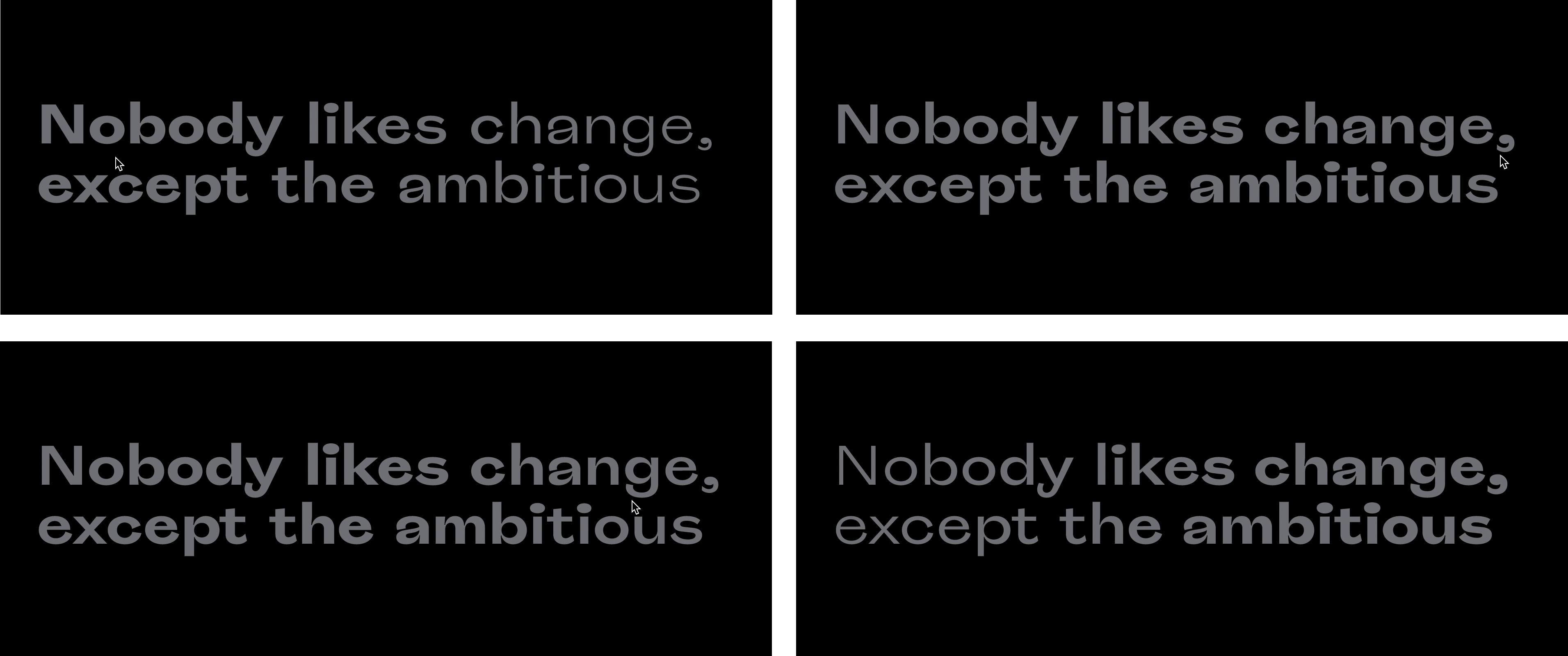
Figure 39 Cursor close to the vertex makes the type approach the strong weight. Cursor far from the vertex makes the type approach the mild weight.
In order to keep things even more interesting the mouse distance is not mapped linearly, but, instead, as a cosine wave. The function that calculates this curve is the following:
export const distanceToPoint = (pointX, mouseX, boundary1, boundary2) => {
  const mouseDistance = Math.min(Math.abs(pointX - mouseX), boundary2) / (boundary2 - boundary1); // Between 0–1

  const mapToRadians = mouseDistance * Math.PI; // Between 0–PI
  const curve = Math.cos(mapToRadians) / 2 + 0.5;
  return curve;
};
Where pointX is the x coordinate of the glyph vertex, mouseX is the cursor x coordinate, boundary1 and boundary2 are the limits of the canvas onto which the text is finally rendered. The function has a cap to prevent further distortions if the cursor is outside of the canvas—which would mean some points would approach the strong version if the cursor was far away enough from the vector. Fig. 40 shows an illustration of the function.
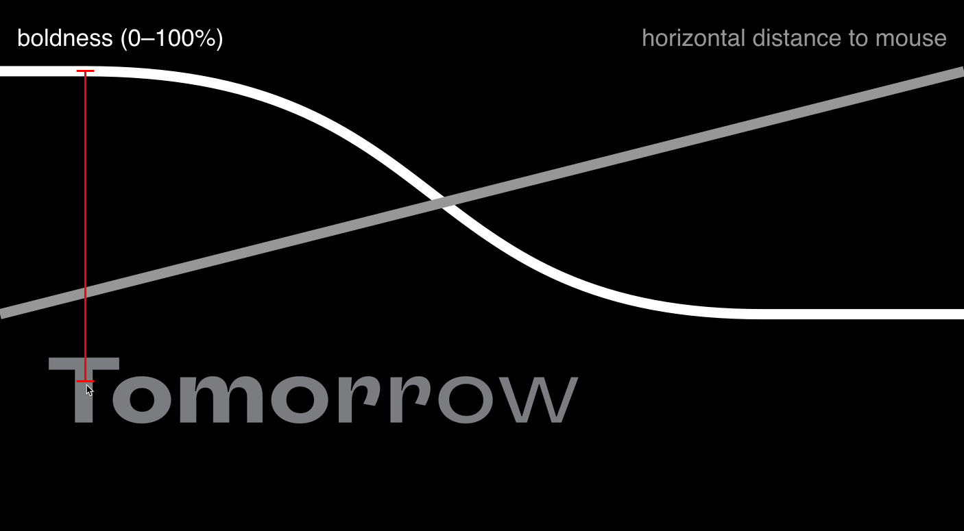
Figure 40 Illustration of the function that converts the cursor position into amount of interpolation. As the distance from the mouse to the point decreases (gray line), the amount of boldness increases.
Fig. 41 shows how the end result looks rendered on a web page.
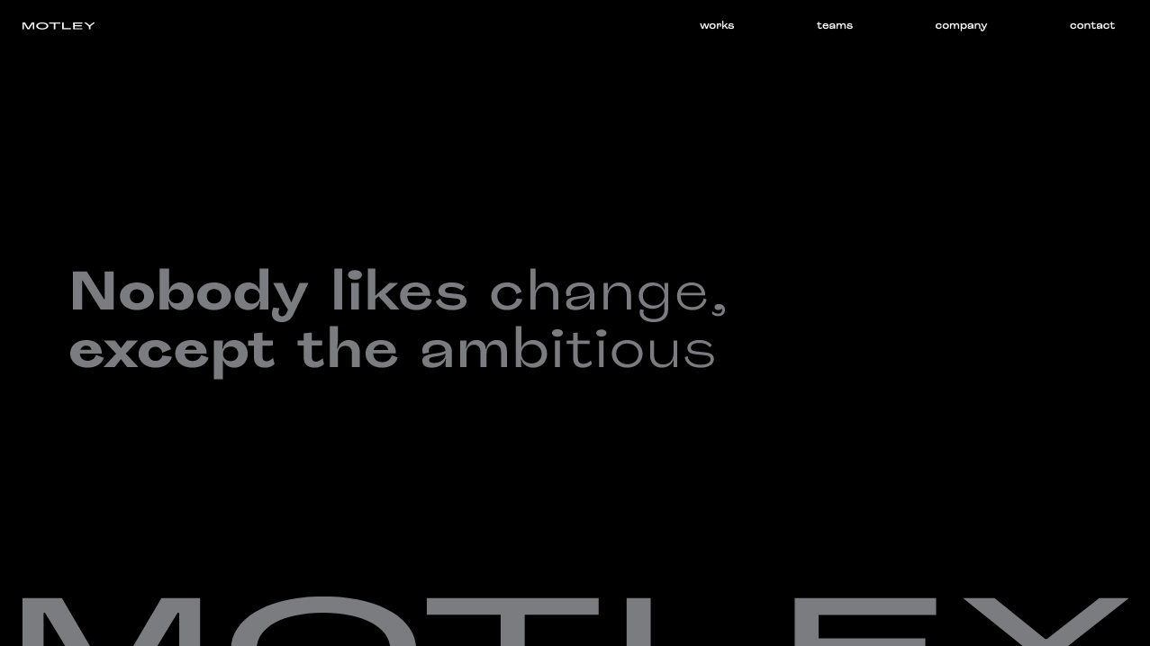
Figure 41 The end result.
Discussion
The main motivation for the work described above was the question how has the modern computer, in the guise of software, caused changes in the practice of visual identity? As said earlier, this question arised partly by the observation of cases such as those presented in the Case studies.
But even before getting in contact with these cases I had already been meditating on a broader research question, which could be formulated like so: how has the modern computer, in the guise of software, caused changes in the practice of visual creation? This has motivated most of the work I do on my free time and, to the extend that is possible, on my work time as well.
But after the discovery of kinetic visual identities, and having a natural inclination towards reverse engineering, I started to make experiments of my own around this topic, even before joining Motley. But at Motley, I was fortunate enough to have an audience of designers and a leadership who gave me the trust, space and support to continue my explorations in a broader context.
My experiments went from a lonely endeavour to a continuous and iterative team work, where I had the chance to learn more about the practice of visual identity. The company methodology as well as the fertile environment I found there allowed me to go on the open-ended explorations that culminated on the work described.
The digital revolution discussed in the section Visual identity in the digital age is implied in the research question by the word software. But the second component in the question is the visual identity, explained in the section Visual identity. There I have exposed two paradigms of visual identity: static and dynamic.
The visual identity presented in this chapter is meant to be dynamic. Its components are only a part of a larger visual identity complex, but every aspect of them which was described here aims to contribute to the balance between flexibility and consistency of the identity.
The brand typeface, Roquefort, is used throughout the identity and plays an important role in keeping the consistency. The flexibility in this case comes from the manufactured variable typeface. This is a means to give designers a continuous spectrum of font weight, but in adition—and at least in the case of the website—the typeface presents itself open to its users, who actualise it by interacting with it in real time.
The same can be said of the company emblem, which is not shown on the website in a recognisable form until the user clicks on the page, at which moment the seemingly random assortment of lines becomes an octahedron. This visual element, when in the form of random lines, is, exactly by virtue of its randomness, so flexible that it is impossible to predict which shape it will acquire next. But this does not harm the consistency of the identity, since the randomness is capped by an algorithm [1] carefully devised to constrain its behaviour.
The visual identity I just described is being launched as I write this thesis. It is, thus, impossible to predict in which direction it will evolve. Hopefully we have laid solid foundations for the work that comes next, when the identity will be facing the challenges of the real world.