Why a kinetic visual identity
What is a brand?
Before we can understand the need for a kinetic visual identity, we need to understand what a brand and a visual identity are. The word brand has had different meanings throughout its modern history. During the twentieth century it meant:
[…] principally the attachment of a name and reputation to something or someone, primarily to distinguish it from the competition.
A brand is also far more than the name, logo, symbol or trademark that highlights its origin; it is imbued with a set of unique values that defines its character and works as an unwritten contract, promising to deliver satisfaction by providing consistent quality each time it is bought, used or experienced. Brands also seek to connect emotionally with their consumers, to ensure that they are always the first and only choice, creating lifelong relationships. [40] [p. 12]
This definition revolves around the brand promise and its relationship with the customers, but Neumeier [27] would argue that it is incomplete and proposes that the contemporary definition shifts the ownership of a brand from the company to the consumers. In summary, “a brand is not owned by the company, but by the customers who draw meaning from it. Your brand isn’t what YOU say it is. It’s what THEY say it is.” [27] [p. 5]
Visual identity
As seen above, creating a brand is a large scale, continuous effort, which also includes the participation of its customers. It is much more than a logo and a few visual assets. Nevertheless the visual identity is a manifestation of the brand and it plays an important role in its context. As a simple analogy we can think of a brand as being to a person, what the visual identity is to that person’s dressing style, haircut, etc. The visual aspect of a person is not the same as the person; he or she also has a voice, a personality and so on. But the visual aspect helps other people recognise him or her in the crowd.
The visual aspect of a brand identity, the visual identity, is at the core of this thesis. But, for the sake of completeness, I will start by defining what a brand identity is. According to Slade-Brooking [40] [p. 28], “[a] successful brand identity is made up of a series of interlinked elements that all aim to communicate the core values or purpose of the brand.” Brand identity is, thus, that part of the brand strategy that falls most easily within the control of a company. It can also include verbal or sound elements—referred to as verbal identity and sound identity respectively. In this thesis I focus on the visual component of a brand identity, the visual identity:
On the most basic level, the brand or organisation’s visual identity differentiates the organisation from others in the competitive marketplace. On a more strategic level, a visual identity could serve the higher function of helping an organisation achieve a positive image or more critical, even negative if it aims to be–and ultimately a positive reputation–in the minds of the public. [44] [p. 130]
The visual identity is itself composed of several elements. These usually include a brand icon or logo [40] [p. 28], a slogan, color and typography [19] [p. 329]. Most cases also include other visual elements, such as imagery (a specific way of using photography or illustrations) and graphic elements (e.g. abstract shapes or patterns that add up to the visual assets of a brand).
In this thesis I will deal exclusively with the concept of visual identity and will not delve deeper into the discussion of branding and brand identity, but that discussion should always be in the back of our minds when talking about visual identity; we need to understand what part it plays in the whole.
Static and dynamic visual identities
The dominant paradigm for creating visual identities nowadays is the static visual identity [25]. The origin of this paradigm is often credited to Peter Behrens: while working as artistic advisor at AEG he created what is deemed to be the first modern visual identity system. Murdock states that the static visual identity:
was born out of and embraces the processes of the industrial revolution, and the progenitors of this approach were driven by the idea of employing commonsense objectivity (Sachlichkeit) to create a totalizing visual aesthetic (Gesamtkunstwerk) through the dismantling of existing visual regimes and the manufacturing of new ones. The geometric simplicity of trademarks produced by twentieth century designers such as Peter Behrens and Otl Aicher, who were working within the static visual identity paradigm, is both a testament to the need this approach has for industrial standardization and for a symbol conceptually abstract enough to represent the ideals of the client organisation. [25] [p. 51]
This model, might appear to be the only approach to create visual identities, but Murdock [25] argues that parallel to the development of this static approach there was a contemporary (even earlier), distinct approach: the dynamic visual identity. Canonical histories of visual identity place the origins of this approach in the 1980s, specifically with the fluid logo and visual elements employed by MTV. But Murdock [25] [p. 14] places its origins in 1908 northern Italy, where the Olivetti Corporation developed a more fluid and incremental practice of visual identity. This practice used the company’s “norm of the beautiful” as a starting point of a multi-year and multi-stakeholder process for creating its visual identity. It did not attempt to impose a single, top-down set of rules and it was composed of “a loosely connected constellation of elements that formed a dynamic and flexible visual identity system”.
Criticism to this approach from the graphic design establishment (design schools, organisations, and practitioners alike) relegated this practice to that of a mannerism or a trend. Instead, dynamic visual identity is an established practice, whose “theoretical underpinnings actually predate the modernist theoretical underpinnings of static visual identity design” [25] [p. 18]. According to Murdock, in the dynamic visual identity paradigm:
[…] the goal is to balance the number of constants and variables within the morphological field. This is done in order to create a visual identity system that is consistent enough to be recognizable yet open and flexible enough to adapt to new situations and contexts (emphasis added). [25] [p. 53]
In the chapter Motley Agency branding 2020: analysis of the kinetic identity I will describe a kinetic visual identity, which is a direct descendant and a sub-category of the dynamic visual identity. The latter—albeit some confusion might arise from the word dynamic—does not necessarily imply motion or animation. It is an expression of how a company’s visual identity presents itself to its stakeholders in different occasions. The project I will describe is indeed a dynamic visual identity, in the sense that not every detail of its implementation are statically predefined. But it is also a sub-category of it, which includes the built-in conception of motion.
Visual identity in the digital age
The visual identity is developed as part of a brand book, which includes other brand guidelines. It is essentially a set of rules that dictate how to produce visual identity assets. Typical cases include logo protection area (how much space there should be around the logo to keep it legible and detached from its surroundings); a color scheme (the standardisation of the colors that are allowed and those that are not allowed when producing visual assets for the brand); etc (see, e.g., Fig. 1).
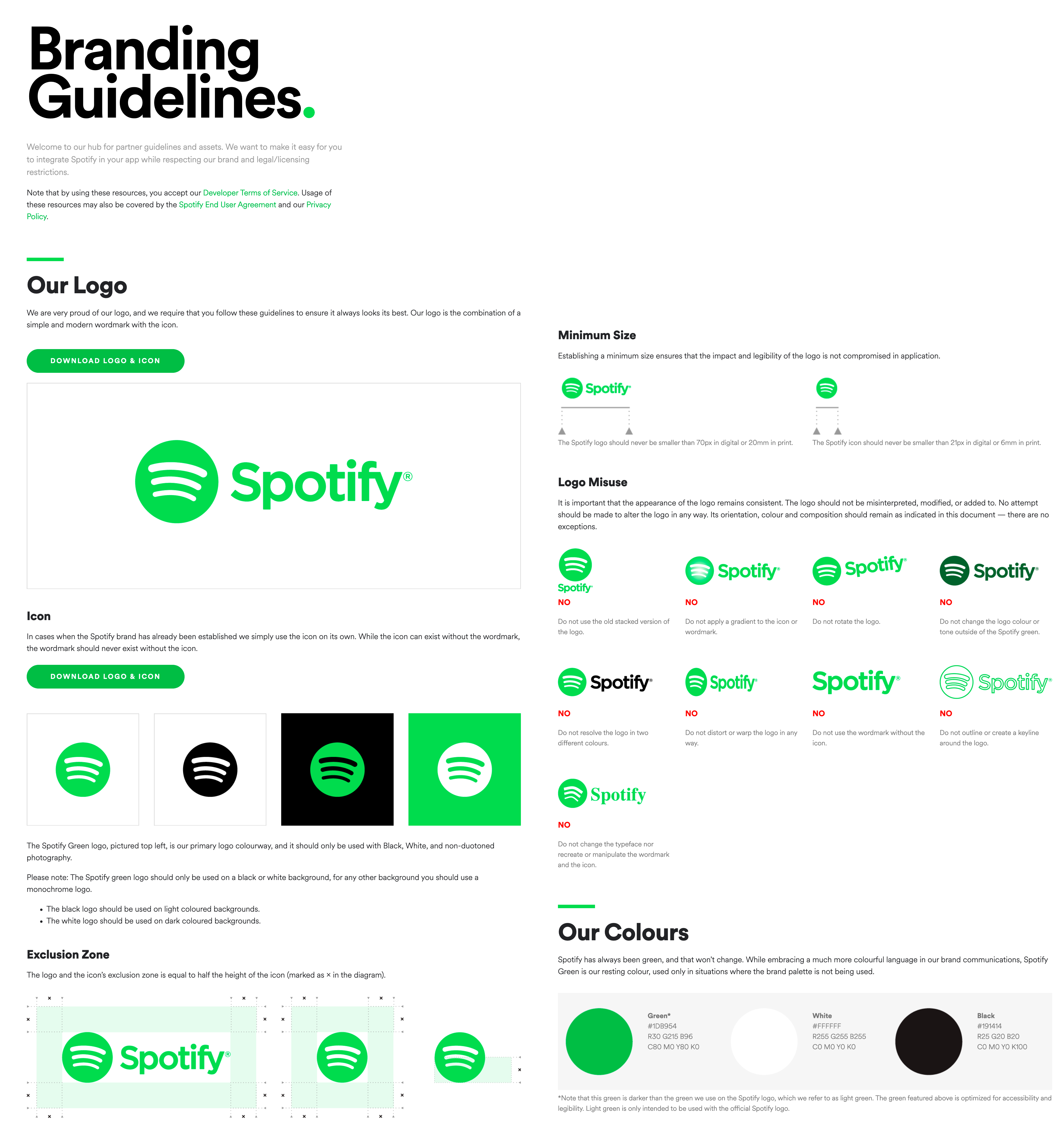
Figure 1 Spotify Branding Guidelines
The rules defined in a typical visual identity guide are meant for humans to read: they are written in human languages (for instance, English) and include visual illustrations of what they are trying to express. This practice, I claim, reflects a historic accident: during the 20th century, when the creation of brand guidelines became widespread, this was the optimal means of conveying rules for producing visual assests in a way that leaves enough room for flexibility and, at the same time, ensures the consistency of the whole.
Before the advent of the computer visual assets had to be created by mechanical means (e.g. offset print, based on handmade layouts). Laying out a page for a poster, for example, meant manually painting or placing graphic elements on a sheet of paper (see, for example Fig. 2), which would later on go through a process of color separation and the print itself.
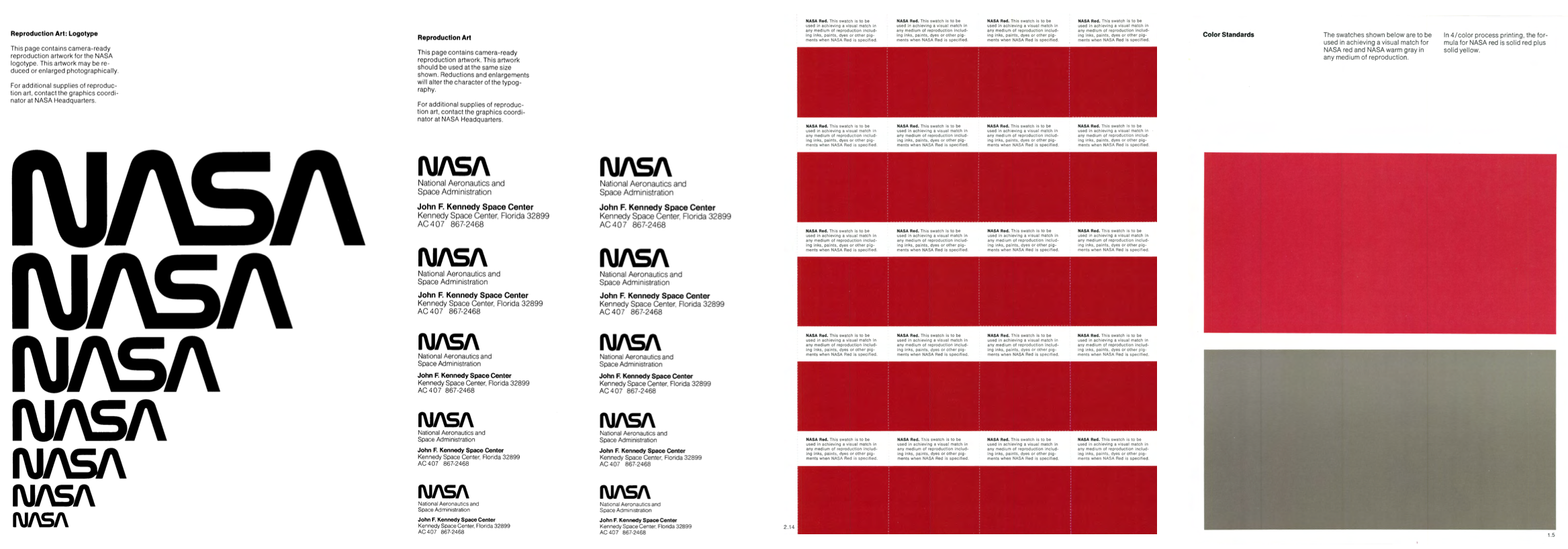
Figure 2 Nasa graphics standards manual: selected pages from logos—“camera-ready reproduction artwork”—and color swatches—for “achieving a visual match in any medium of reproduction including inks paints dyes or other pigments” (emphasis added). [26]
When computers became established as the primary means for graphic design, they also brought in the baggage from the print era. Software was developed that emulated the print process as it was done during the 20th century—e.g. the Adobe suite: InDesign for page setting, Illustrator for creating graphic elements, Photoshop to enhance photographs [37] [p. 10].
As much as it can be argued that these programs helped popularise digital design and allowed designers to use digital media to do graphic design, they also embbeded—and even imposed, I would argue—a paradigm for creation [37] [p. 10]. That paradigm was the inheritance from the Gutenberg printing press era.
In contrast, computer languages—such as C++, Java, Javascript—are designed for a much broader spectrum of activities than only creating images in a certain way. They are general purpose tools and, for that reason, are conceived to be more powerful. The unfortunate side effect of this acquired power is that they are less intuitive to use and have a much steeper learning curve.
The practice of the guide described above for creating visual identities is anchored in the tradition of static visual identity (Static and dynamic visual identities) and the mechanical print processes (see The movable type and the digital revolutions). It does not take advantage of the full power of the digital medium in the stages after the publication of the brand guide, since it necessarily understands the visual identity as a static monolith of normative rules (“use the logo in this way”, “use only these colors”, “use these predefined graphic elements”). The publication of a closed, totalistic brand guide is what makes a visual identity static—as opposed to dynamic.
Moody states the corporate identity—that is, essentially what I am calling here a static identity—was made up of “words and pictures” and “helped the people in big organisations stand out, for a while” [20]. But it had to be replaced by the brand identity, which, to him and as described in the Visual identity section, goes deeper:
[…] not just making a brand visible and desirable, but creating design assets in their own right. Each component could stand alone, and form part of a whole to tell a bigger story. [20]
And he continues to ascertain that:
[a]n identity has to be a manifestation of an organisation’s soul, in a big, broad, ‘Bowie’ sense. It needs to listen, behave and react to users with human-like nuance and in real-time. [20]
As an example he refers to the work that Wolff Olins did in collaboration with Onformative for Oi Telecom: “a user-generated logo that reacts to the sound of the customer’s voice” [41]:
[t]he eventual shape and colour of the logo depends primarily on the pitch and volume of the person’s voice – a deep voice likely to produce red or brown colours, whereas a high pitch voice logo will likely be skinny and fluorescent. [41]
“Oi” is the Portuguese word for “hi” or “hello”, the logo loosely resembles speech bubbles, used, e.g., in comic books to metaphorically give voice to characters. In this identity it is as if the brand is giving voice to its customers. There is not one single expression of the logo, but as many as there are users willing to lend their voice to the application (see Fig. 3 and 4 ). The company logo is not predefined, but must be actualised in the real world in order to exist.
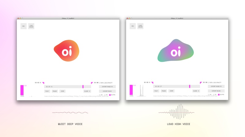
Figure 3 The application used to generate the logos
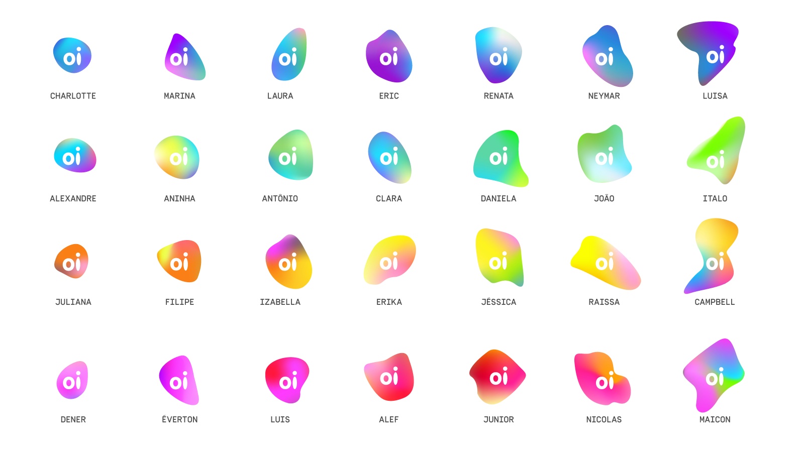
Figure 4 User generated logos
As I said above, visual identity guides are essentially sets of rules for generating visual assets. Computers are machines that excel in following rules. In theory one could devise a computational procedure to generate visual assets based on traditional visual identity guides. I will refer to this procedure simply as software, which according to Kitchin [16] [p. 3]:
[…] consists of lines of code—instructions and algorithms that, when combined with appropriate input, produce routines and programs capable of complex digital functions.
But computers are better at following rules than humans are; they are capable of following far more complex rules (or rules with more complex implications) and in a much shorter time. More complex rules can create more variety within a predefined set of constraints. They can also give rise to expressions that are impossible (or virtually impossible) by standards of manual labor.
More speed also means that more assets can be generated in less time. Although I do not claim that speed is a value in itself, I argue that there could be a gain in quality if only over the sheer amount of assets generated and the subsequent increase in statistical probability of better results. Also, more quantity gives the human agent (e.g. designer) more possibilities for their different use cases she might encounter. This can be enhanced by a software for generating assets based on parameters given by the user.
Lastly such a tool can generate the assets in real time for the end users with their participation, as was described in the case of Oi Telecom. This way the brand visual elements can interact with their customers wherever they are, as long as they do it via digital means.
In the following sections I will develop two examples of brand identity visual components (Typography and Graphical elements). They are not meant to be an exhaustive analysis of the components of a visual identity, but, instead, were chosen among the many possibilities that these components can assume, because they were the ones explored in the project described in the chapter Motley Agency branding 2020: analysis of the kinetic identity. They form both the theoretical background and the motivation for the project. They also happen to be the ones I am personally more interested in.
But first a preamble about two revolutions.
The movable type and the digital revolutions
The printing press, developed around the middle of the fifteenth century by Johannes Gutenberg and already widespread by 1500, was a technical innovation that laid out the ground for a cultural revolution that eventually culminated in the Illuminism [38] [p. 4]:
The defining moment of the European Renaissance is neither the fall of Constantinople in 1453, nor the discovery of the Americas in 1492. Rather, it was the ‘Gutenberg Revolution’ of the midfifteenth century which marked the emergence of modernity in the Christian west. [38] [p. 1]
The aforementioned revolution affected even what we could now call, in retrospect, graphic design:
[…] the printed page, with its system of sections and subsections, footnotes, marginal notes and paragraph divisions developed a standardized spatial display: different typefaces might denote hierarchies of information; graphics and illustrations, sometimes (in the case of medical works) deploying the new device of a keying mechanism to relate word and image, complemented what was to be found in the text. [38] [p. 7]
The digital technologies have had a similar effect in several areas, and play in our time (that is, twentieth and twenty-first centuries) an equivalent role as the printing press played for the sixteenth century. According to Sawday et. al. it is likely that “the postmodern era will eventually be understood as beginning with the development and deployment of computing technology” [38]. [p. 1] [1]
On the other hand, it is also the case that new technologies take time to be absorbed culturally, and practices from the preceding period may continue to coexist with the new developments for a long time.
What we encounter, then, in the last years of the twentieth century as much as in the sixteenth century, are extended periods of overlap between two technologies: scribal and print in the Renaissance, print and digital resources in our own era. [38] [p. 10]
Brands nowadays are expected to have a presence in an increasingly digital environment. Neumeier states that there are ten new realities in the world of a brand, one of which is the fact that “Brands need to flow through multiple technologies” [27] [p. 16]. This means that they are susceptible to (and I argue they should be designed for) motion and interaction. Or, as Moody puts it: “[m]otion and interaction became part of the palette” [20].
Now we are at a position to define kinetic visual identity: that which has motion and/or interaction built into its genetic code. By “genetic code” I mean anything that allows stakeholders to create assets for the brand. This could be, for instance, a brand guide (see, e.g., Fig. 1) or a desktop application (see, e.g., Case studies).
Vector graphics
One of the aspects of this digital revolution is the possibility to represent things as mathematical formulas. This has the advantage of giving the creator (designer or developer) the ability to manipulate shapes before rendering them on a screen or printing them on paper. In this section I will explain one of the ways to represent images as mathematical formulas, namely the vector graphics. This is the way in which the manipulations described in chapter Motley Agency branding 2020: analysis of the kinetic identity are performed, exactly because of its incredible power.
Before images can be displayed on a screen they need to be stored in memory in some form. There are two ways in which computers can represent images in order to store them: raster (sometimes also called bitmap) and vector graphics. The former divides the image into a grid of pixels (short for picture elements) and assigns a color to each of them. This grid is “a complete description of what is shown on-screen at a given resolution” [36] [p. 33]. This is essentially a machine language description of what the screen shows to the user in which to every pixel on the file corresponds a primary color light element on the screen.
Another way of representing an image on a computer is by means of vectors, which “store a list of equations that define the image” [36] [p. 35]. Instead of storing every pixel that composes, say, a line on a screen, the vector file would store the first and the last point and tell the program to draw a line between them. This method is convenient because it allows us to represent scalable shapes, i.e. shapes that have the possibility to be scaled without quality loss. Usually it is not known beforehand at which size a certain typeface or graphic element will be rendered on the screen. Having them as abstract representations allows us to define the size of the graphic elements in real time.
As a final note, I should recall that ultimately any computer graphics is discrete, because the computer screen is discrete—i.e., made up of a countable number of light elements (this is what we mean by the term screen resolution). This means that even the vector graphics have to be rasterised (i.e. “the continuous line must be approximated by a finite set of screen pixels”) in order to be shown on a screen [13] [p. 28].
In the chapter Motley Agency branding 2020: analysis of the kinetic identity I will deal with the Emblem and the Typography created for the project described there. In both cases I have used the HTML canvas element to render the graphics. The canvas is “an HTML element which can be used to draw graphics via scripting (usually JavaScript). This can, for instance, be used to draw graphs, combine photos, or create simple (and not so simple) animations” [22].
The canvas element cannot be resized without loss of quality, though; it creates a raster image. But the idea behind the method that I used was to be able to manipulate the vector information of the emblem or the typeface before they are rendered on the screen. If there is need to update the size in real time, then it is also easy to re-render the scene, which, in practice, makes it a scalable image. Nothing would prevent us from using SVG instead of a canvas, except maybe for performance.
Typography
Typography has a long and established history, with a taxonomy grounded on the print tradition [2]. But the existence of digital media is relatively new to this field and has imposed new challenges as well as opportunities for further research and development. As Brownie [2] put it:
Although there is an established discourse about the field of temporal typography as a whole, and dentification of many of the key features of temporal and digital typographic environments, there is very little existing discussion of the various behaviors exhibited within some contemporary typographic artifacts.
Kinetic typography per se—that is, the effect of transforming typography over time—does not depend on digital technologies to exist, nevertheless the capabilities brought to it by the advent of the software is noteworthy:
[…] the method in which written communication is authored and presented has never stopped evolving. From cuneiform markings on clay tablets, to pen and parchment, to the Gutenberg press, to computers and the internet, technology has always provided text with new mediums to express itself. The explosion of available computing power has added a new possibility: kinetic typography – text that moves or otherwise changes over time. [17]
Central to the motivation that led to the kinetic typography project described in the subsection Typography of chapter Motley Agency branding 2020: analysis of the kinetic identity is the fact that “typography can be visually as well as verbally expressive” [2] [p. 3]. When a designer chooses a bold typeface, as opposed to a light version, she is expressing something, which can be a statement about the brand (as an obvious but illustrative example: suggesting that the brand is bold). Therefore, the text written in a certain typeface conveys a message, but also the carrying typography reinforces or sometimes contradicts that message. It can even convey a parallel message.
Systematic approaches to kinetic typography have been, so far, generally restricted to the movement of the body of text or individual letters, at most, e.g. “rapid rhythmic motions, changes of scale, and rotation”; “slow and decelerating pace, reduction of typeface weight, and a shrinking motion”, “slow-in slow-out movement, squash and stretch, movement in arcs, anticipation, follow-through and secondary action” [17]. These are time transformations of the elements outside of the scope of the typeface (except in cases when the typeface is shrunk or bent, but these create deformities, not variations on the typeface). This has been due to a lack of “rich history, and accompanying academic study, of either static typography or film” [17].
These restrictions made their way into digital technologies (including web and mobile app development), and, since the object of this thesis is a visual identity conceived for the digital (as well as for the print) world, let us consider the state of web—taken as a metonym for the digital realm—typography as of now.
In order to use a specific typeface—e.g., on a web site—the developer needs to load one or a set of font files (for example via CSS web fonts) [24]. These font files are static by nature, which means, for example, that a letter can be rendered on screen by using one glyph from one font file. “Glyphs comprise all marks in a typeface from letterforms and numerals to punctuation and symbols” [4] [p. 33]. If the developer would like to change the appearance of that letter, say, by making it bold, she would have to specify another font file and order the browser to re-render it. With this method, there is no way of transitioning between the two: when the letter is re-rendered using another font file it will change into it immediately.
@font-face {
  font-family: "myFontLight";
  src: url("myFontLight.woff");
  font-weight: light;
}

@font-face {
  font-family: "myFontBold";
  src: url("myFontBold.woff");
  font-weight: bold;
}
.my-thin-letter {
  font-family: "myFont", "Font Name", serif;
  font-weight: light;
}
.my-bold-letter {
  font-family: "myFont", "Font Name", serif;
  font-weight: bold;
}
A more modern approach is that of the OpenType Font Variations, which “enables many different variations of a typeface to be incorporated into a single file, rather than having a separate font file for every width, weight, or style” [23]. The idea is to have a font file that includes axes—usually weight, width and italic—for continuous variations (see Fig. 5, 6). This approach allows the developer to transition continually between two states of the typeface.
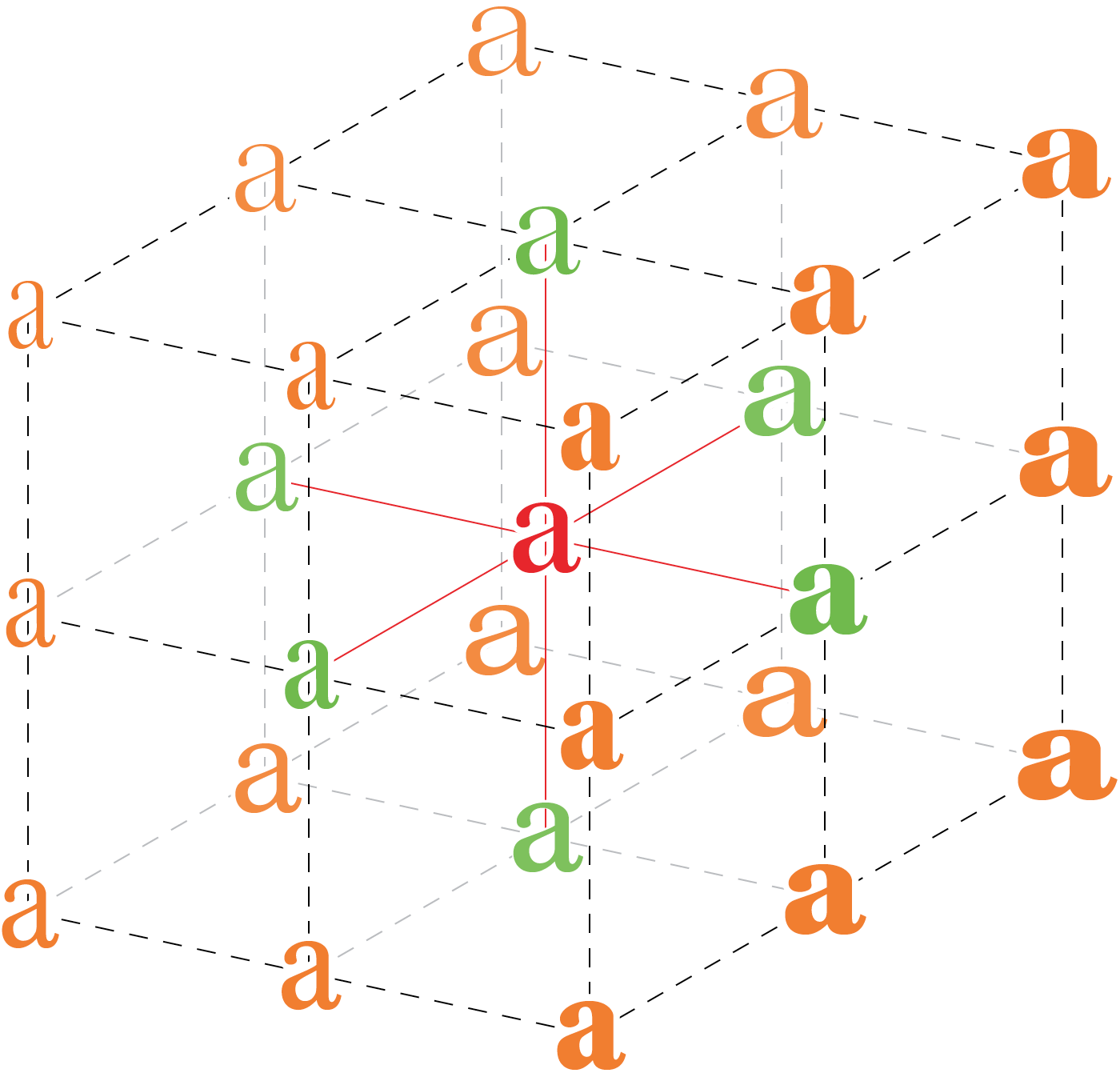
Figure 5 Normalised design space of a 3-axis variable font [11].
[Typeface: Kepler, an Adobe Original designed by Robert Slimbach.]
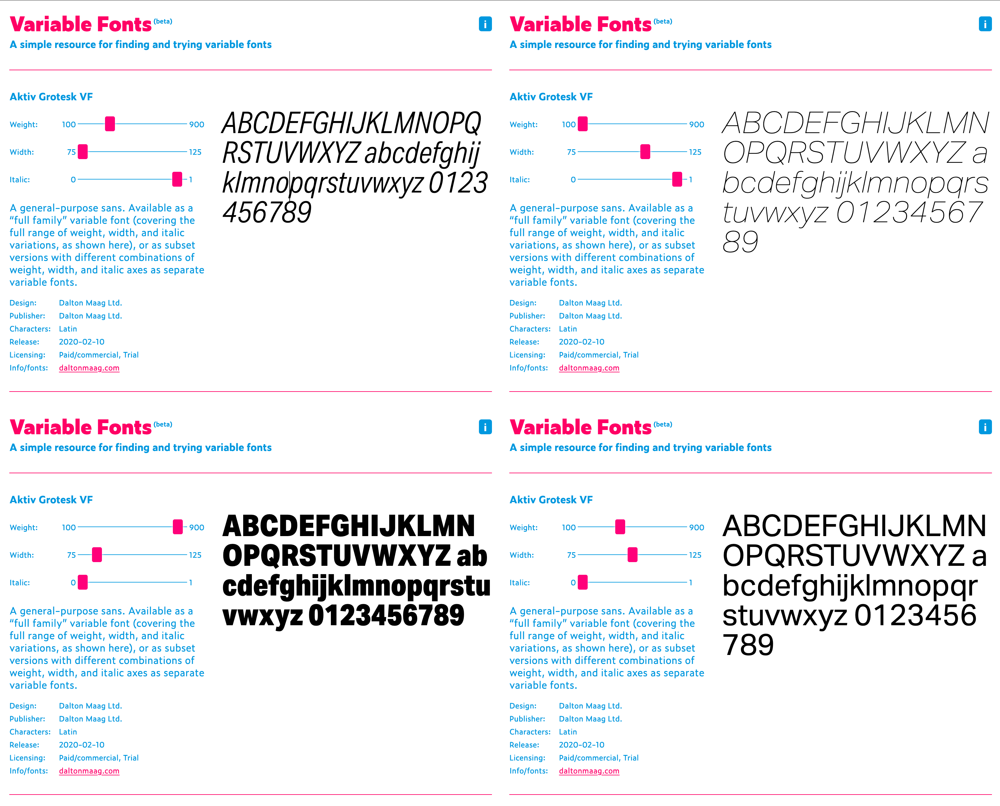
Figure 6 Example of font variations (compare the slider positions) [39]
It is not clear how this technology will evolve and how—or whether—its use will spread. Hudson, for instance, states that “[t]he idea of fonts containing interpolable design space and named or dynamic instances is not new” and that such approaches “failed to take-off in the 1990s, for a variety of reasons” [11]. But he goes on to explain why he believes the OpenType Font Variations will have a brighter fate.
However this technology turns out, and despite giving the website designers a lot more freedom to design expressiveness, it still does not give full control of the vector data of a glyph. My hypothesis is that this is most likely because the visual expressiveness—as opposed to verbal expressiveness, see again Brownie [2]—of the text has not been the focus of attention of the technology. Since this hypothesis is outside of the scope of this thesis, I will not attempt to prove it.
Another direction in digital—more specifically web—typography development provides us with a deeper access into the anatomy of a font face. Tools like Typr.js [34] and OpenType.js [29] expose the vector information of each glyph in a font file. The vector information (that is, the cartesian coordinates x and y for each point required to draw a glyph) can then be manipulated by computational processes which would otherwise be unavailable to the developer, such as interpolating the points from one font file to another one, effectively turning a regular set of fonts into a variable font. This, as it turns out, is the object of the subsection Typography.
Graphical elements
Another cornerstone of the visual identity of a brand is the set of graphical elements. Broadly speaking, creating graphic elements for a visual identity boils down to arranging visual elements on a two-dimensional—and sometimes three-dimensional—space, of which there is a long tradition of theory and practice. Puhalla [35] [p. 7] claims that “[t]he elements of spatial organisation are central to visual interpretation and perception. These elements form a visual language.”
Russian painter Wassily Kandinsky was a notorious advocate for the development of a robust theory of the visual language. Barasch [1] [p. 358], referencing Kandinsky, says that “[…] in paintings of all times we find some kind of ‘system of composition’. In abstract painting, however, the ‘inner necessity’ according to which composition is patterned is revealed.” This “inner necessity” comes from the rules of visual perception and the relationship between visual elements on a plane.
Puhalla [35] [p. 8] explains that:
The inherent ingredients of the mass space elements—point, line, plane, and volume—generate the syntax of a visual language system. Along with the attributes of shape, size, color, and texture, they formulate the visual language structure within the boundaries of the image area.
Similarly to what was shown for the history of Typography, the development of brand visual elements also inherits an historical background that often neglects the state of current developments in technology. This can be illustrated by how traditional brand guides prescribe or even predefine visual elements and how they should be used (see for example Fig. 7).
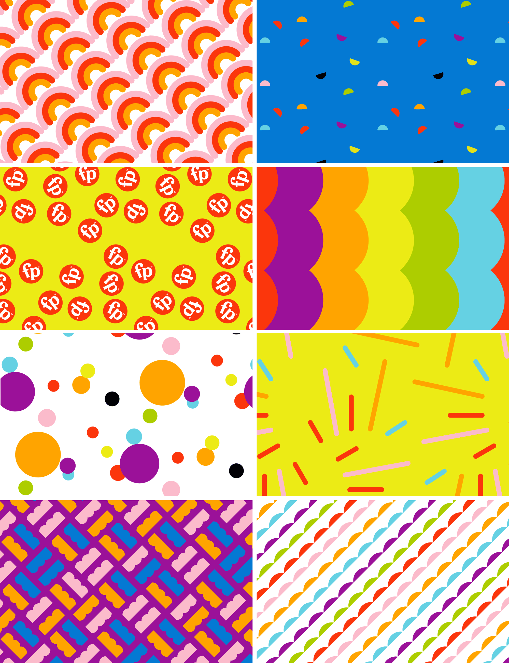
Figure 7 Fisher Price graphical elements
Again, I am not claiming that every graphic element in a visual identity should be created by computers, but I am arguing that the space of possibilities for their creation has been expanded by the development of digital technologies. When creating those elements nowadays we need to take into account—and somehow visually express—the dynamic environment in which the brands live and relate to their customers [27]. This expansion of the space of possibilities brought about by digital technologies (software, more specifically) is eloquently described by Fry and Reas:
History shows that technologies such as oil paint, cameras, and film have changed artistic practice and discourse, and while we do not claim that new technologies improve art, we do feel they enable different forms of communication and expression. Software holds a unique position among artistic media because of its ability to produce dynamic forms, process gestures, define behavior, simulate natural systems, and integrate other media, including sound, image, and text. [10] [p. 99] (emphasis added)
By that token, and parallel to what has been said above about Typography, we can also argue that graphical elements in a brand identity may—or sometimes should—be conceptualised with motion built-in. This, of course, does not mean that the motion needs to be real; it can be suggested even by an image printed on paper (Fig. 8).

Figure 8 Genesis Beijing application of graphical elements [28]